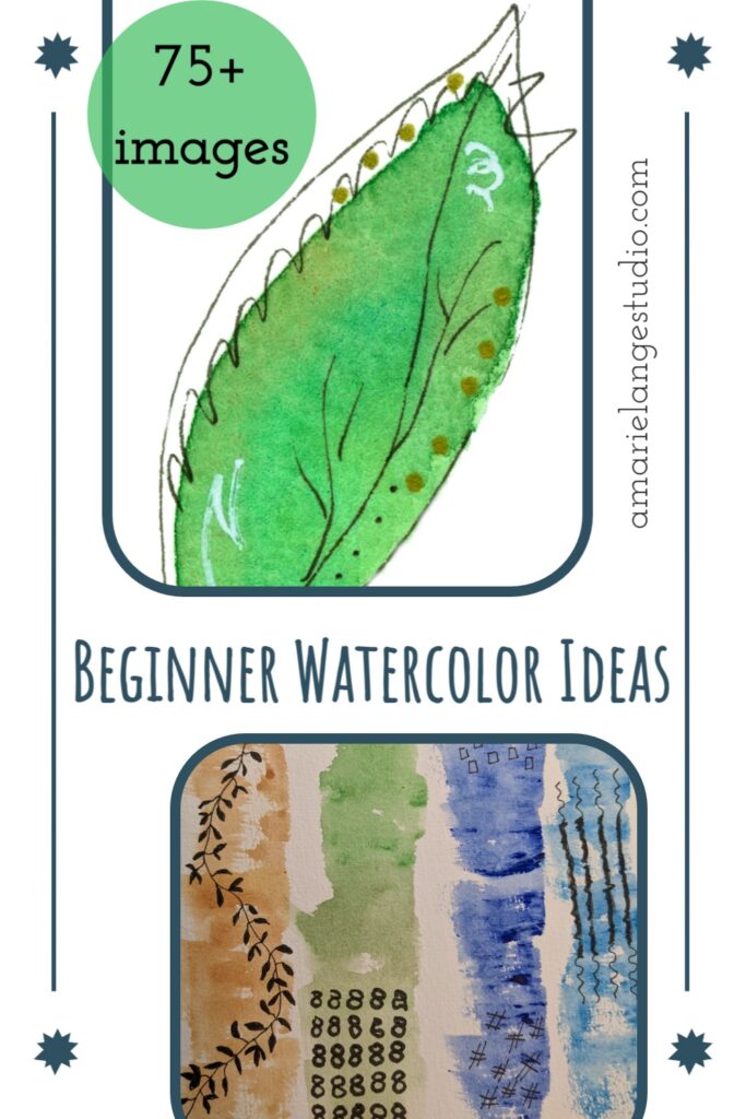
Do you long to pull out your watercolor paints, a sheet of watercolor paper, and dive into a wet technique creating different colors and simple shapes? Me, too! I am a mostly self-taught watercolorist and I understand the need for easy watercolor painting ideas.
There are a lot of good watercolor painters on the internet and I feel privileged to have learned from many of them. I want to give you a great way to tackle new watercolor skills starting with what may be a new way of thinking about painting with watercolors.
Here goes.
Watercolor doesn’t have to be hard.
There. I said it. Out loud (in writing.).
Watercolor has that mystique, doesn’t it?
Ideas like watercolor is difficult. It takes years to learn. You just have to put up with a lot of frustration.
Well, I can tell you, it does take practice, I’ll readily admit that. However, the truth is that watercolor art can be broken down into manageable steps. And once you start seeing those “steps”, the entire process not only gets easier, it gets a lot more enjoyable.
I think this mindset, if you will, is more important than actual painting techniques. Those can help, to be sure, but if you’re convinced every technique is going to be difficult…well, it probably will be.
For myself, once I started focusing on the pieces of a watercolor project, I saw my skills take a dramatic turn for the better.
And I love that feeling of looking at a reference photo or another painting and knowing “I can do that.”
I didn’t have that feeling at first. Do you want that, too?
I’m going to show you more than 75 simple watercolor painting ideas – easy for beginners to start with. Keep in mind, these are brief overviews since this blog post is really long! (Some of the projects have links to other posts that will go into more detail, so look for those if you want more steps.)
Some of these ideas will definitely look simple to you. And some may not look easy to you at all. That’s ok! I will give you a couple of tips – ways to see the project, if you will – for each watercolor idea that can help you fine tune your practice.
And practice you must if you want to get comfortable with watercoloring! But I have learned how to study each piece I paint. Break it down into steps and only focus on one step at a time until I’m satisfied my hand is doing what my eye is seeing.
And bit by bit I see progress. That’s even how I learn and improve my watercolor painting skills today.
Let’s get started. And remember to have fun!
Watercolor Painting – Easy Topics For Starting
TABLE OF CONTENTS
Abstract Painting
Greens Leaves & Vibrant Colors
Flower Painting
A Whimsical Painting Style
Different Ways of Lettering
Wet Paint With Fruits & Veggies
Pine Trees & Tree Blossoms
Different Techniques – Ladybug, Fish, Owl, Butterfly
Beginner Artists Life Painting – Objects From Life
Basic Techniques – Starting Point For Nature
Abstract Painting
Abstract watercolor painting is at once simple looking and intimidating.
You can go ahead and drop any feelings of intimidation. Abstract art is such a great way to loosen up your head and your hand.
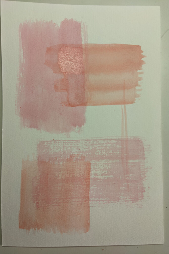
Pick a favorite color, wet a flat brush – but use just a tiny bit of water, you just want the brush barely damp – gather up some paint and stroke a flat ribbon of color. If your brush is dry enough, you’ll get a nice drag of paint with white lines of the paper shining through.
Create a simple geometric pattern, like this easy pink weave.
Experiment with different amounts of water on your brush. Combine dry brush strokes with wet ones. The more of a dry technique you use, the more texture your finished artwork will have. Experiment with different size flat brushes and discover the looks you like.
The more time a beginning painter can spend practicing with different watercolor brushes, the faster new techniques will feel like old ones.
This next simple abstract was so much fun to make!
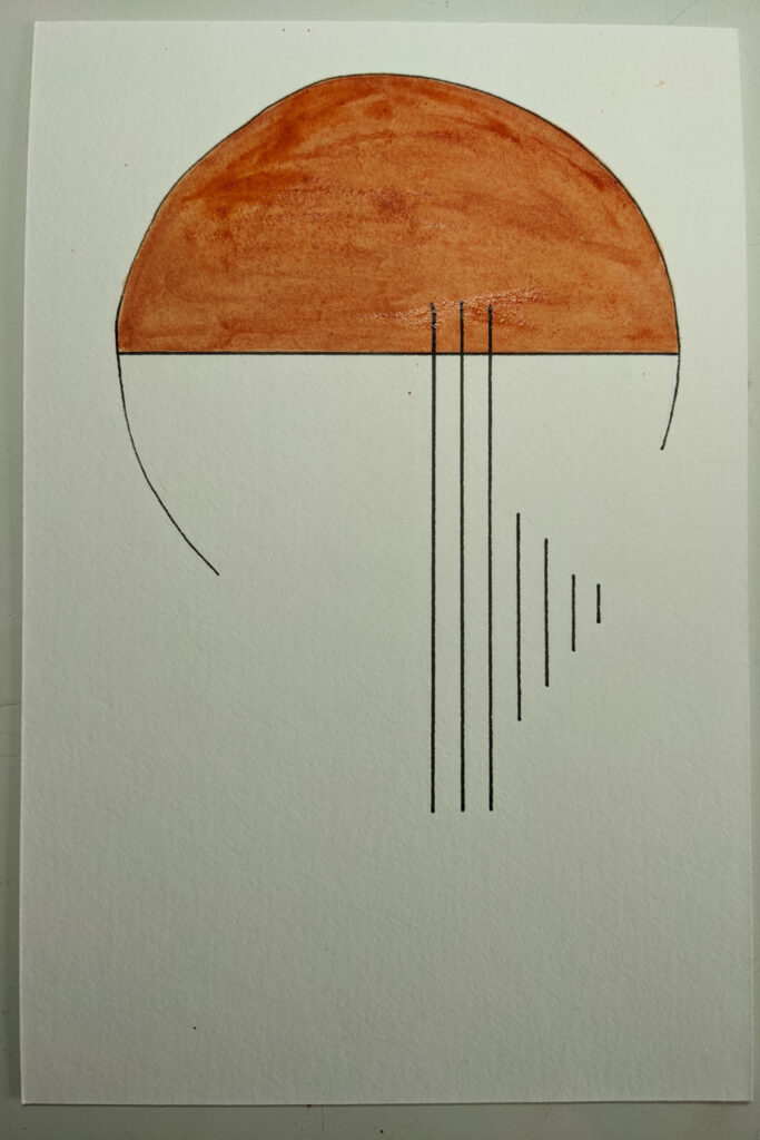
I drew an easy arc with a compass – I didn’t even measure – and drew a few straight lines for contrast. Then filled in with beautiful watercolor.
The challenging part of this is deciding on a design. The best way to do that is to simply start drawing shapes and lines. See where they intersect. Fill in some with watercolor. Take a step back. See what you like and what you don’t. Make a new piece with the new information you now have.
This works. Give it a try. Have fun with it.
This next one uses a wet method of painting.
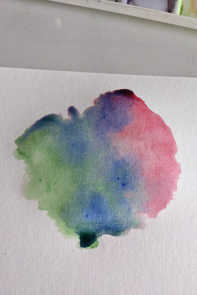
Using a fair amount of water, drop that water from a large round brush onto your watercolor paper. Spread loosely. Dip your brush back into your first color and dab the color into one edge of the water on the paper.
Let the color spread through a section of the wet paper. Don’t use too much water (makes sure it’s clean water or your colors will muddy) and dab a second and third color on opposite sides of the wet area of your paper.
If necessary, use gentle brush strokes to carefully move the paint on the wet paper so the colors will bleed into each other.
This is a classic wet technique; it’s a great way to practice ideas on brush control, color theory and how colors blend and react with water.
You can make some gorgeous backgrounds using this technique. These kinds of easy watercolor paintings make beautiful greeting cards. You can showcase just the artwork alone or easily add text.
This watercolour painting is perfect for beginners.
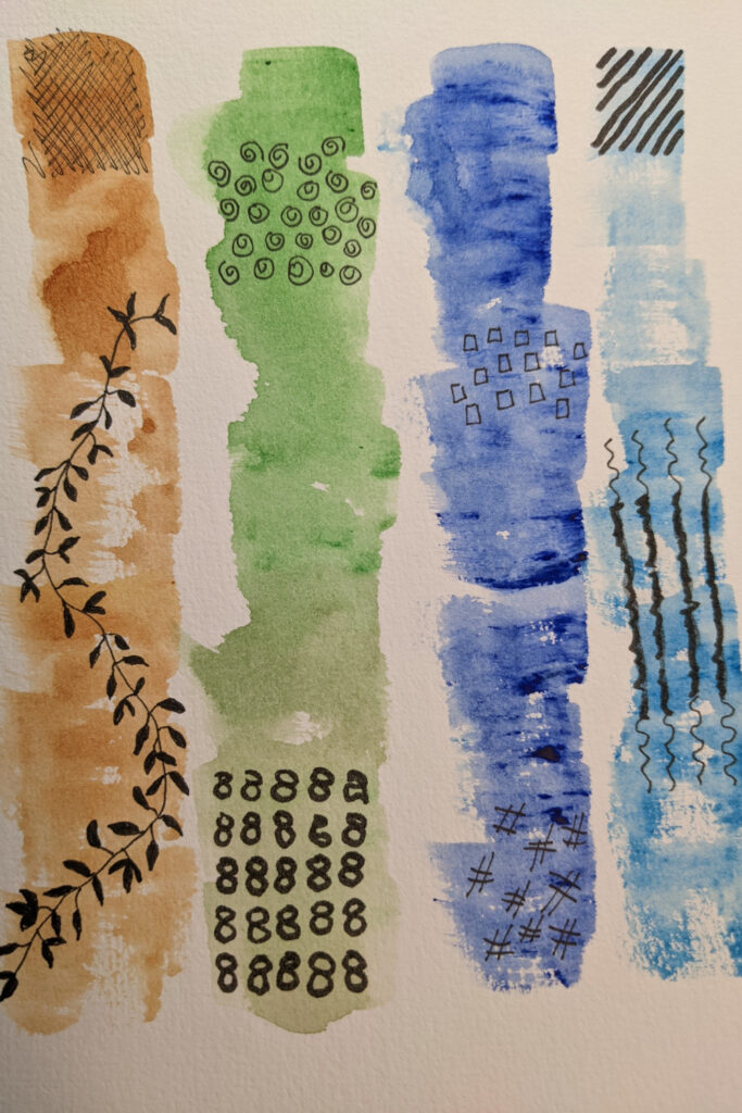
You get the beautiful effect by choosing four watercolors and painting four long strips of color. You can use a dry brush or wet brush technique for this. Personally I did both!
I tried to keep a lot of texture in the brush strokes, letting the white watercolor paper peek through regularly and varying the tones of color – some strong some light.
After the paint is dry, use a waterproof pen and doodle small designs on select portions of the artwork. It really helps to practice your doodles first on a separate piece of paper and consider different shapes and placement of doodles.
But don’t worry too much about these things, since at the end of the day, this is watercolor abstract art and you are the master of your painting! Wherever you place your doodles is good!
Are you enjoying yourself yet? In our line up of simple watercolor ideas, the next idea is not only easy but much fun, too.
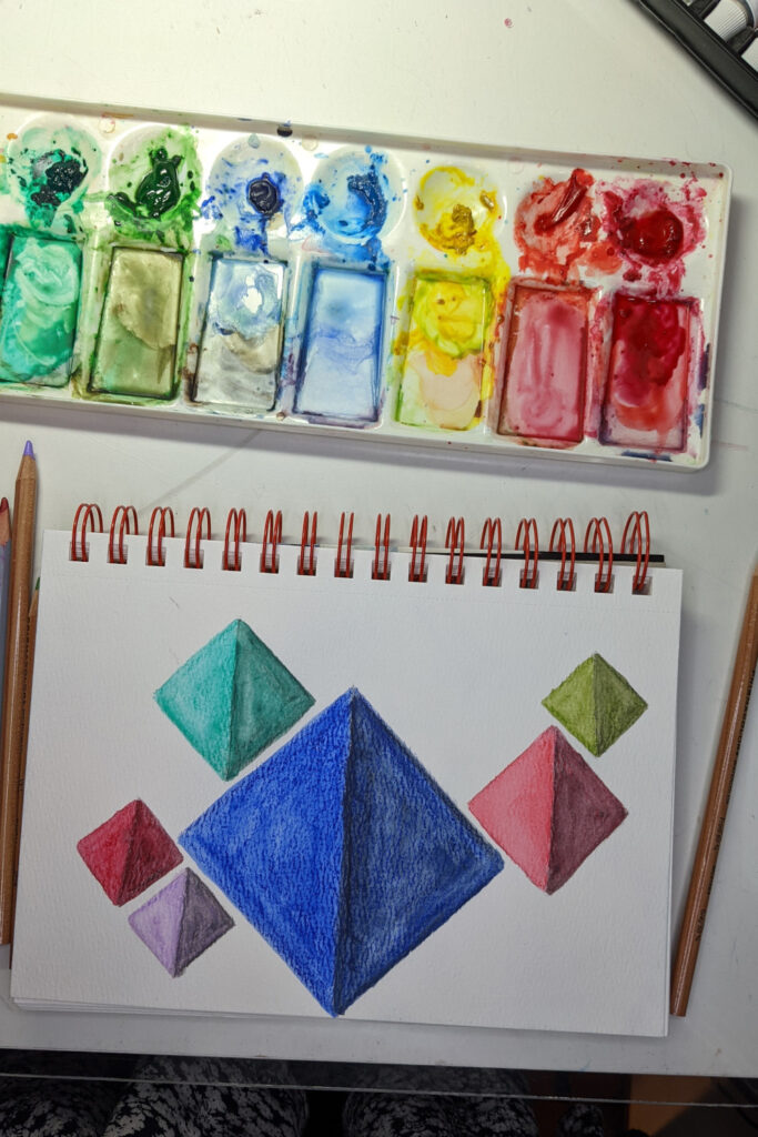
This abstract idea takes off in a new artistic direction. Combining watercolor pencils with watercolor gives you the best of both worlds.
After drawing random sized diamonds on my watercolor paper and choosing the colors I want, I used watercolor paints on one side of the diamond, starting with a highly saturated inner line of color and brushing it out to the edges.
Then I used the watercolor pencils to fill in the other side, using extra pencil at the inner line. As I used a brush to add water, I carefully started at the outer edges of the diamond and moved inward. Doing so meant I could preserve the extra saturated color I laid down at the inner seam.
I stuck with bright colors as the best way to give a real pop to these simple shapes. If you try this and find you’ve pulled too much water from the center to the edges use a clean dry paper towel to gently blot up some of your color from the edges (or wherever you’d like less saturated color).
Another thing I like about painting geometric shapes is the brush control practice I get.
I’ll keep saying it; the more time practicing with a brush in your hand the more comfortable and confident anyone will become with their watercolor painting ideas – easy or not.
Continuing our look at using geometric shapes in easy abstract watercolor art, let’s switch from diamond shapes to circles.
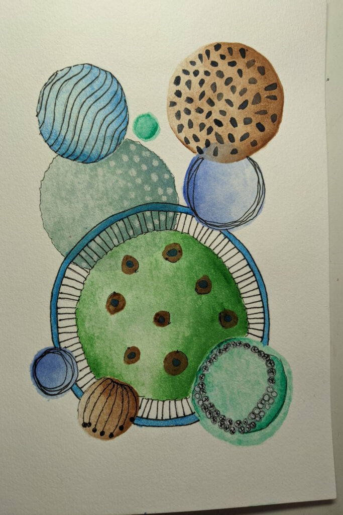
You can trace these circles, use a compass, or simply freehand them. Totally up to you. It works best for me when I try out shapes and arrangements on a piece of drawing paper first and then transfer that to my watercolor paper.
Add watercolor as you want. I aimed for gradient washes, creating the illusion of shading on each circle. You can add as many layers of watercolor as you like, letting each layer dry between applications for a deeper effect.
Then I inked, with a waterproof pen, all kinds of fun doodles. Again practicing first on a separate piece of drawing paper helped me be happier with the final project.
You might try some new techniques with this next abstract project.
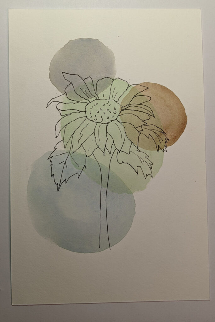
I started by tracing a flower onto my watercolor paper with waterproof ink (make sure it’s waterproof or it will smear when you do the next step) and after the ink had dried I added three circle-shaped washes randomly to the artwork.
I kept the washes fairly light so the ink shines through. This is super easy for beginners. It’s easy to use colors that will coordinate with current decor, making this artwork look very nice when framed and hung.
Next. It’s super easy to use current artwork to create new artwork, thereby extending the productivity of your efforts.
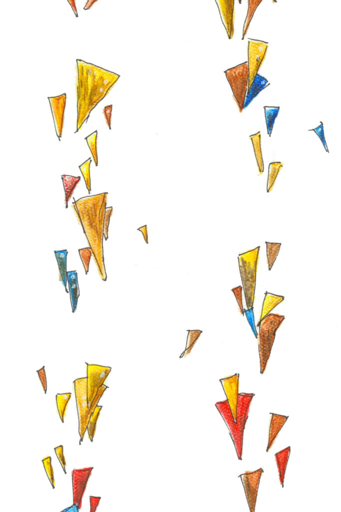
One way to do that is through patterns. This triangle pattern, which you can see would be easy to create, is actually the watercolor pencil triangles that I used to create my watercolor owl, which you will see later in this post.
You could use a pattern like this on a greeting card, printable paper, or just framed on its own in a nursery to complement other artwork.
Simple and fresh.
Another simple pattern to try.
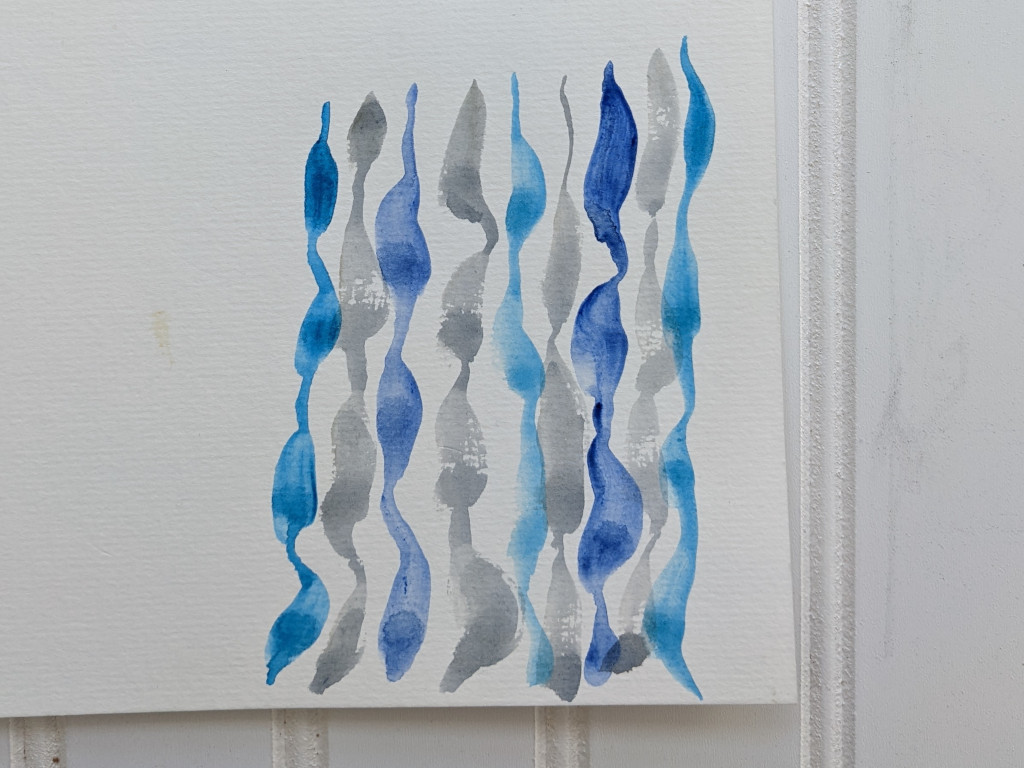
By creating an abstract pattern in the colors of your choice, you can also use those patterns for a watercolor background.
Make the painting large enough to fit whatever background you need or scan the painting into an image manipulation software program (think Photoshop or Gimp) and make a seamless pattern from it.
There are several excellent classes online that will quickly teach you how to do this if it’s a new idea.
To create this particular easy watercolor pattern, I used a round brush on dry paper. Once your brush is filled with watercolor paint, place the tip of your brush on the paper, drag a bit, push down to create a wider paint area (keep dragging), lift back up to the brush tip while continuing to slowly drag the brush down the paper. Then repeat.
Greens Leaves & Vibrant Colors
Watercolor leaves are very popular and for good reason.
They can be made to be easy or difficult; but let me encourage you to try to duplicate a challenging looking leaf.
Leaves are very forgiving because they come in all shapes, sizes and shades of green and brown. Your eye will identify a beautiful watercolor painting as a leaf even if it doesn’t look like the reference photo to you.
As an artist, I usually try to change up a reference photo and not go for realism. I am more interested in new practice ideas and refining my own style.
Always remember in watercolor to start with the lighter shades and add depth as you add layers.
Personally, I often add too much depth too fast and that causes me problems, so that is where I focus; on adding subtle layers and more of them.
Let yourself develop your own style, too. This is the right place to follow a step tutorial or just let your brush wander, learning how the paint flows.
For example, start with a basic leaf shape.
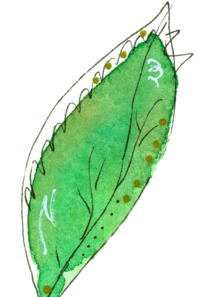
As always, you can trace or draw freehand. There is no real detail in this painting.
I added color and when dry, some inked and gold details for fun.
The best way is to add what looks good to you.
Now try adding several of these leaves together.
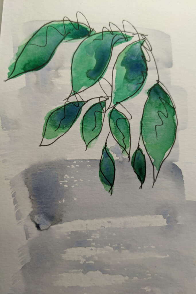
Vary their sizes, shapes and positions.
If it helps to look at a great reference photo and note how leaves hang, then do so, but don’t get caught up in realism for this. We’re keeping this super simple.
You’ll note I have added a bit of shading to my leaves. Experiment with using a dry technique of dragging a mostly dry brush with paint on it over a dried base layer of color.
I also added my leaves over the top of a dry brushed light gray background.
What kind of simple background could you try before adding your leaves? Just remember to keep it light or your top painting won’t show up well.
There is no correct or incorrect way to do this. Be kind to yourself and keep painting!
Next idea…
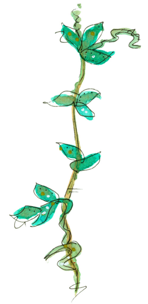
Now try adding these same leaves on a vine in a simple line. This makes for easy borders in a journal, a card, or an easy printable wall hanging with text added.
Now you can see how practicing a few leaf shapes and beginner watercolor techniques can give you a lot of easy painting ideas you can use in a variety of good things.
These next leaves have a bit more definition.
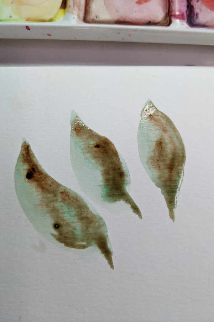
If you’ve practiced the leaves above you are ready to try these.
No panic! You can do this. I used a wet-on-wet technique for these leaves. Simply draw or trace your leaf shapes on watercolor paper. Fill in the shapes with clean water. Add a few dabs of a light-ish green. Let that water spread and fill the leaf shape. Help it with your brush if you like.
While the leaf is still wet, dab in a bit darker green mixed with a small amount of brown. You can do this as two separate colors or mix the colors slightly and add at the same time.
Add the color to the same side of each leaf so the light appears to be coming from the same direction.
The important thing to remember about using a wet method is not to over mix your colors. Dab a couple of times and see what they do. If you need to move the paint around more, go ahead. It’s better to mix less and wait, though. Again, practice will train your eye on how to do this much better than me telling you precise instructions.
Trust yourself and paint.
Here is a different type of leaf in different shades of green.
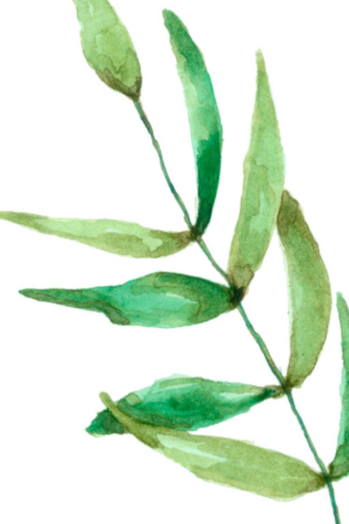
Trace or freehand and enjoy adding a dab of color here and a dab of color there. You can do these colors in layers letting everything dry in between or you can use a wet technique.
Note how I added a dab of darker color to where the leaves are attached to the stem. That helps with the realism factor as we edge closer to that and farther away from abstraction.
Here we have the same basic leaf pattern as the last image with an important difference.
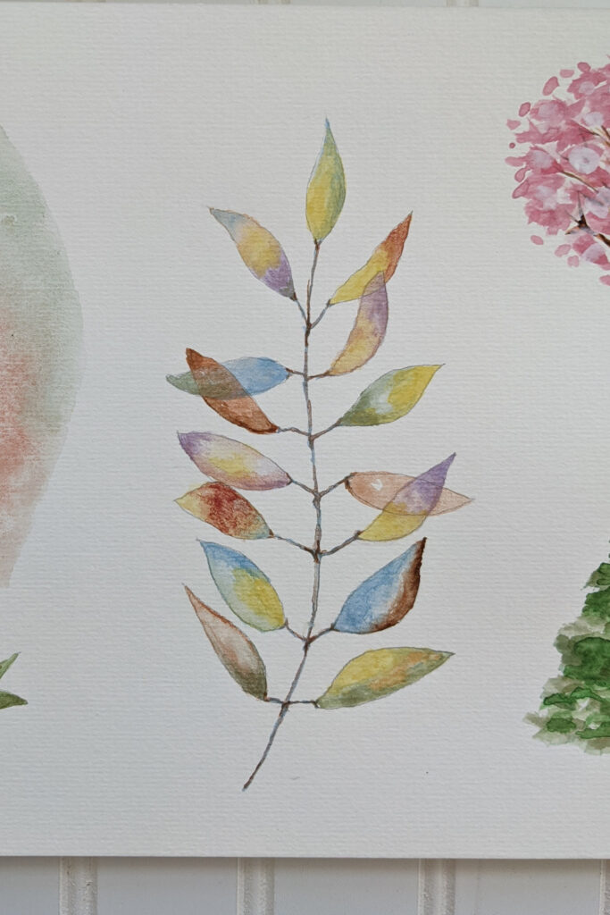
We are using multiple colors and we are aiming for transparency of the leaves.
To do this you’ll need to lay down a thin wash of your first color, let it dry thoroughly, and then add a thin wash of the next color.
I’ve included a flower with this same technique in the flower section. This may take a few practice leaves to get these new techniques feeling comfortable. Go for it!
Transparencies like these are a lot of fun to paint so I hope you’ll give them a try!
Now we’re getting into a more realistic leaf image.
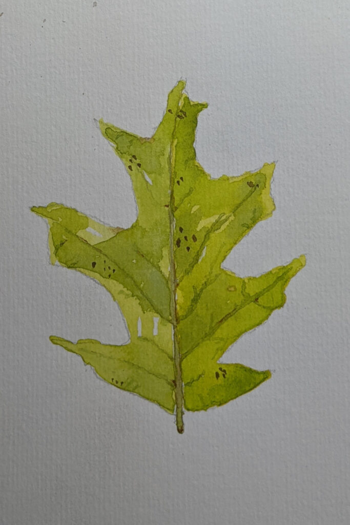
Again, don’t get caught up in perfectionism. If you want to do botanical painting where every vein is shown and to scale, by all means, go for it. But that’s not what we’re doing here and botanical painting is not what I would consider a beginner technique. It’s a lot of fun but certainly more challenging!
Use a clean piece of watercolor paper and trace or draw the leaf shape. I have used layers of watercolor letting them dry in between, then added the details with a tiny liner brush.
Of all the paint brushes you will use in creating a beautiful painting, using a liner brush well will give you a lot of flexibility and allow you to do fine details with ease.
What am I going to say next? I’ll bet you can guess: it takes practice to use a liner brush exactly the way you want to. Spending some time practicing different techniques with a liner brush on a separate piece of paper will greatly help your satisfaction when you get ready to add finishing details on a watercolor project.
Below are sweet eucalyptus leaves.
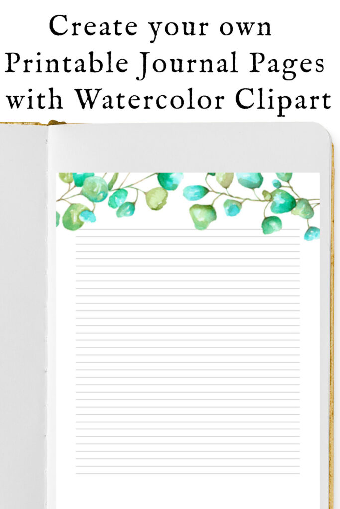
I like to paint them transparent, but they look beautiful in all kinds of ways.
Building on our last leaf, use a liner brush to add a thin vine to which you can add as many eucalyptus leaves as you like.
As you can see, among other projects, I have used them on printable journal pages as clip art.
Gorgeous – and simple – eucalyptus leaves dress up any printable artwork with ease.
Let’s pivot to something more whimsical, but still beginner friendly.
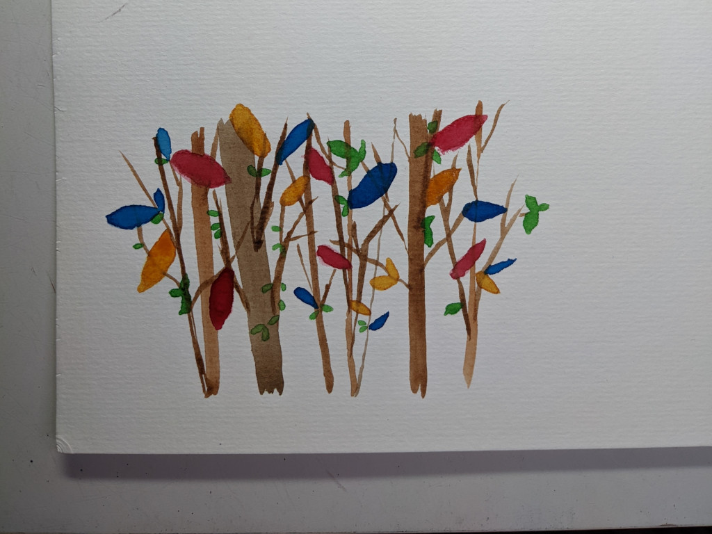
In this image, I’ve drawn straight, vertical branches. I used a round brush but you could also use a flat brush. A round brush will probably be easier for the smaller branches, however.
The colorful leaves are added by using a round brush and saturated bright colors.
Start out with just the tip of your brush and drag a bit, then press the brush to create the full leaf, then let off the pressure and finish the leaf with just the brush tip again. (We did the same technique with the abstract blue lines painting above.)
Again, practice will improve your confidence. This is such a cute, whimsical and colorful easy “forest”. So much fun to create.
Here’s a next step.
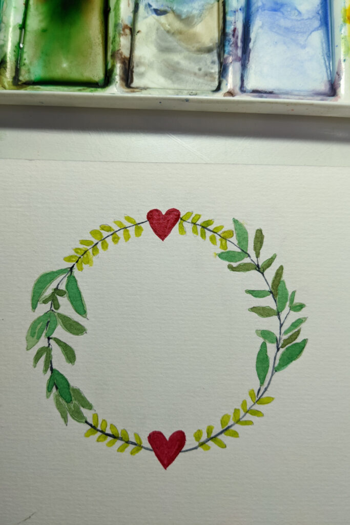
You’ve practiced some leaves. You’ve used different brushes. Try drawing a circle on your watercolor paper and adding leaves along the circle.
And just like that you’ve got a wreath!
I added the freehand hearts at the top and bottom, but that’s certainly not necessary.
Or maybe you have another idea of a doodle to add instead of hearts.
This is a great example of how we can learn to paint simple elements, step by step, one at a time, and then combine them in any way we want.
This is what I meant at the beginning of this post about breaking down a project into easy-to-follow, manageable steps.
And just like that, watercolour painting is less intimidating.
You’ve got this! Be sure and keep some of your early work so you can see how you progress.
If you can paint just a few minutes every day or an hour a week, you’ll see your progress very quickly. Really!
Remember this watercolor wreath because we’ll add to it in a later project.
I know this next wreath watercolor painting idea looks complicated but now you know it’s not.
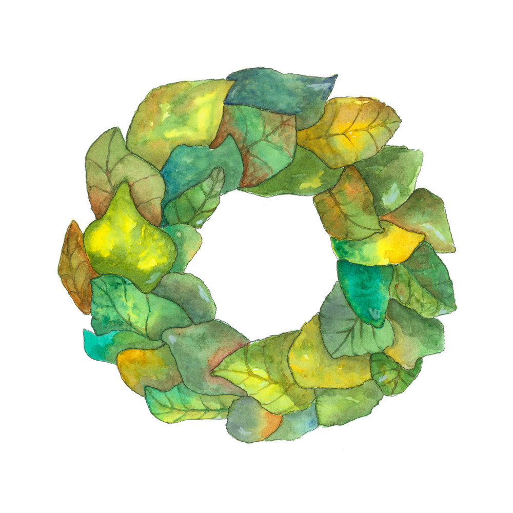
Draw your circle. Draw or trace the leaves of your choice onto the circle. (Remember to keep your drawing light as you cannot erase after you paint over the pencil lines and sometimes they’ll show through.)
Erase the pencil lines where the leaves are overlapping. Starting at the back of your wreath, paint your leaves. Let them dry thoroughly before painting adjacent leaves so they don’t bleed into each other.
Use a wet technique or a dry technique or a mix of both.
Add as many layers of color as you like.
Take your time. Stand back and look at your work between layers. You will see things you couldn’t see at the beginning of your painting but the colors and shapes will reveal things you’ll want to paint next.
Note how contrast works. Painting a dark section against a light section makes both sections pop! This is why there will be both light and dark on the same leaf.
This wreath definitely has layers but that doesn’t mean a beginner watercolorist can’t paint it.
Break it down into its parts. Paint each part. Again, take your time.
Beautiful.
Flower Painting
Flowers are also very popular in artwork. We’re going to explore these simple watercolor paintings in a variety of floral art.
And yes, beginners can do each of these.
This blog post is not about in-depth watercolor tutorials.
It’s far too long for that. This is just the starting point for easy watercolor ideas and basic watercolor techniques.
But it is a solid start.
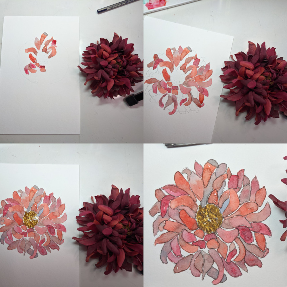
In the above image, I show you four steps in creating this lovely flower.
The flower itself is filled with dark colors, but I lightened it up for my painting.
See how again, I am breaking the flower apart into easy, manageable pieces – the petals.
I paint each petal. I can change the color or depth of each petal as I wish.
So I make decisions on the flower, petal by petal. This makes it easier.
This is a closeup of an abstract flower.
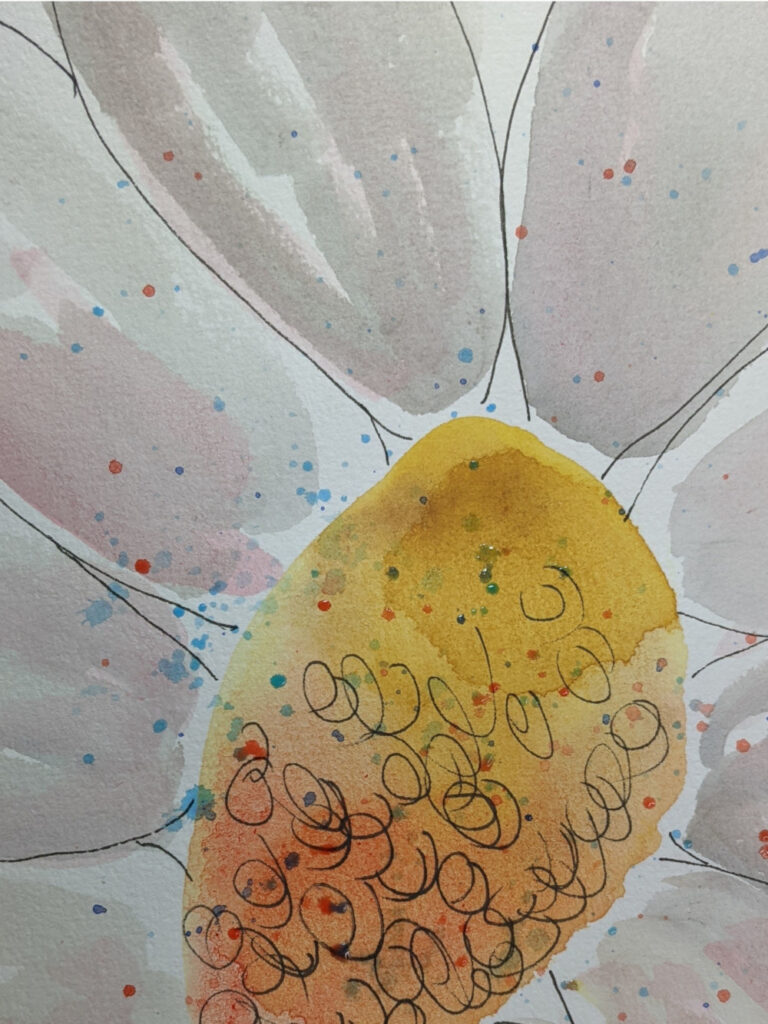
It is designed to be a white flower, so I used two layers of light and slightly darker-light gray.
This would be beautiful framed and added to minimalist decor.
And it’s super beginner friendly. Go for it!
It can really help to do a flower petal study.
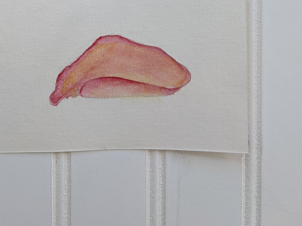
To learn to paint folds will improve the quality of your nature artwork.
I was intimidated by folds in leaves and petals when I started painting.
Then I took a couple of classes and watched the instructor very carefully as they added folds.
And I realized how easy it is.
Take a few minutes to really look at a flower petal. See what happens to the light when a petal folds up in front of your field of vision.
Draw or trace it. Then paint it 10 times. Each time you paint it look closely at what you’ve done and compare it to your reference photo. What tiny thing can you change that will improve it?
Then paint again with that new knowledge.
Progress. Just like that.
Next is a white, transparent flower.
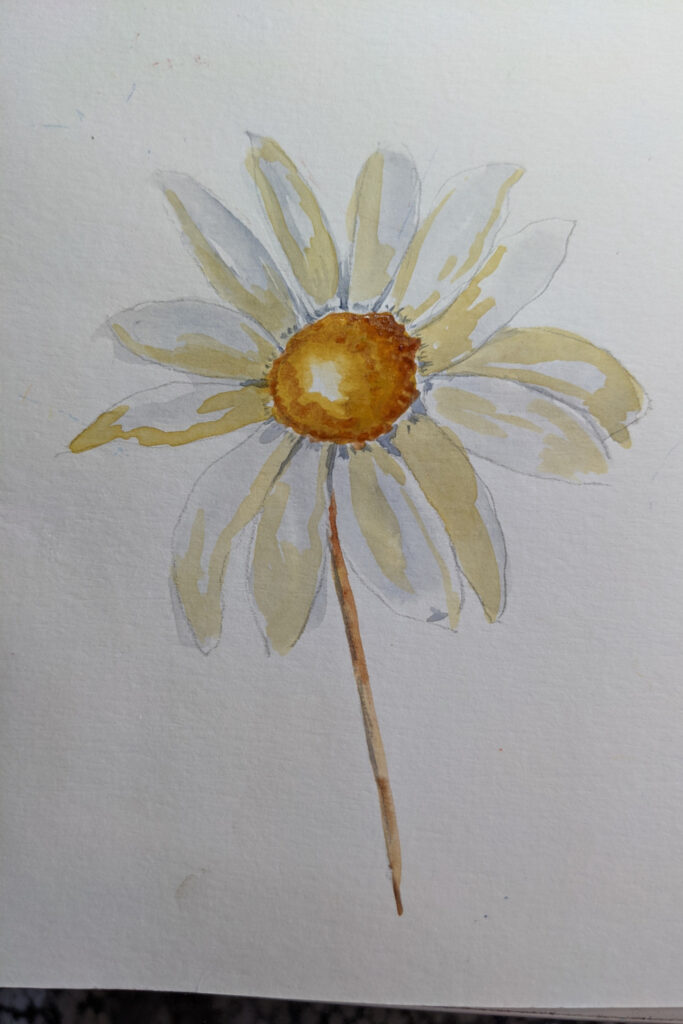
Keep your grays and yellows very very light. You can always add another layer, but it’s tough – though possible – to lift much color.
I’ve added deeper color to the center to make the flower pop.
You could paint this flower, scan it to your computer to remove the background, upload it to a print-on-demand site and create a cute mug or a sweet t-shirt.
Okay, I know, to process art digitally is beyond the scope of this post! But I want you to see how easy it can be to create all kinds of things – that you’ve painted! – with these simple watercolor ideas.
A love of watercolor painting can take you far.
OK, same idea as the last flower but with more color.
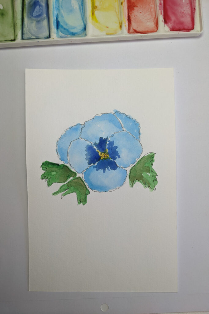
Again, paint in layers, adding as little or as much color as you want.
Deepen the edges of your petals where they meet the next petal to help each petal stand out.
Here’s that translucent flower I promised you earlier.
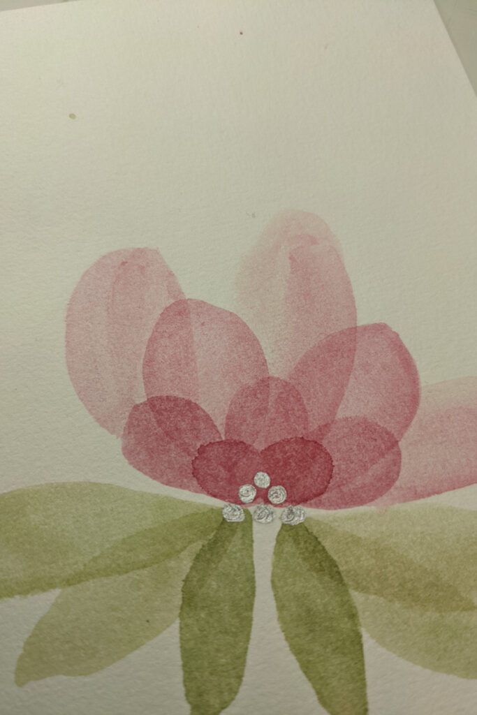
These are so much fun to paint! It has a very simple design, as you can see. It’s a great opportunity to learn how to paint transparent layers.
The simple step instructions are:
- Draw or trace the flower shapes. Be sure and keep your pencil lines light, light, light.
- Lay down one layer or wash of color.
- Let it sit for a few seconds. You can experiment with different amounts of time but don’t let the paint dry before doing the next step.
- Gently dab at the paint with a clean dry paper towel in the center of the petal.
- You can even take a clean, almost dry round brush and gently push the paint to the edges of the petal for a more pronounced edge effect.
- Let dry thoroughly.
- Paint next layers of petals and leaves.
- I finished my translucent flower with a silver paint pen and added dots to the flower’s center.
I’m going to introduce a flower that is a little trickier here, but I know you’re ready for it.
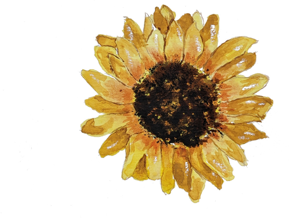
This sunflower can be as simple or as difficult as you want to paint it.
Up to you.
Trace or draw the flower, then paint the petals one at a time.
The ones in the back will be slightly darker.
Paint the center starting with a light yellow. Add a couple of layers of darker color over that being careful not to completely block out all the light from the first layer.
There are lots of ways to do that, but the easy way is to take a stiff old paint brush, one made for use with acrylic paint or oil paints and lightly dab – not brush – the paint onto the center.
Take your time and don’t overdo (remember, you want to let that first layer of light paint shine through in a few areas) but this technique works like a charm.
Since you tackled a slightly harder beginner flower…
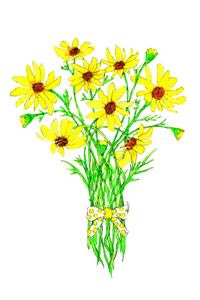
I thought I’d reward you with a slightly easier flower image now.
Again, this can be as easy or challenging as you want it to be.
Think of it as being a tracing, then painting in the lines with yellow paint for those flowers.
I’ve stuck with light colors for these flowers, but you can decide what you want for your own creation.
I’m kind of a fan of whimsical flowers.
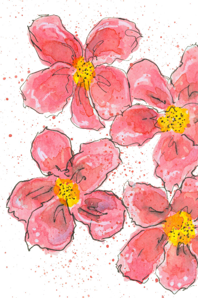
Here is the first of three examples of pink flowers.
Note how I created a white spot on each petal to show light reflecting off. I used a white gel pen, but you can use white gouache or white acrylic paint, too.
This will help your flowers feel more real, even when they’re not in the realism style.
Following is a pink rose.
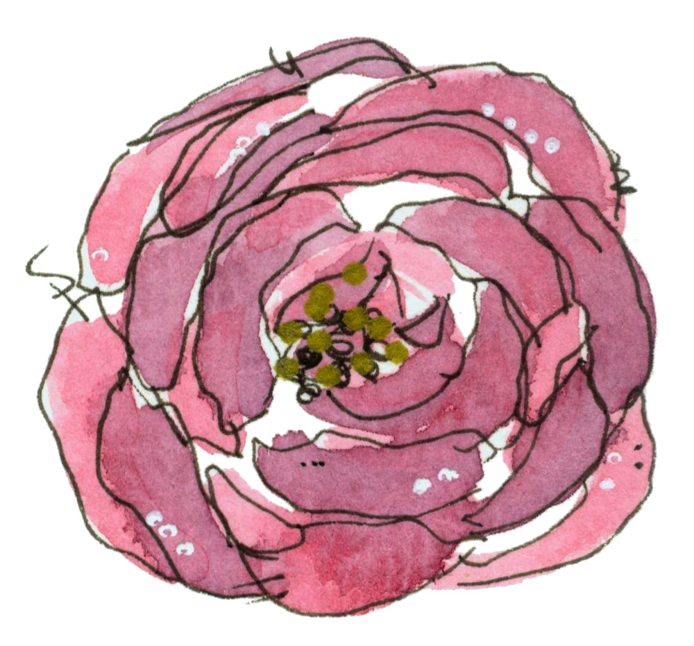
Notice these petals wind around the center of the flower in a circular manner.
If you finish your flower and it feels too flat to you, an easy fix is to add gel or paint pen doodles, like the dots and flourishes in this floral image.
Creating shapes & shades.
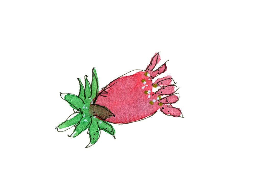
I want to show you how different shades and shapes of the same color so easily produce different results.
How fun is this little flower?
And you’ll notice it doesn’t necessarily look like any real flower.
But your eye knows it’s a flower.
Let your imagination guide you as you practice these watercolor flowers.
A great technique doesn’t have to be complicated and can still result in a good result.
Add the fine details you want and skip the ones you don’t.
Start with a good idea, do the easy things, and you can end up with a beautiful painting.
Have you been painting along with me?
This is also a whimsical flower image.
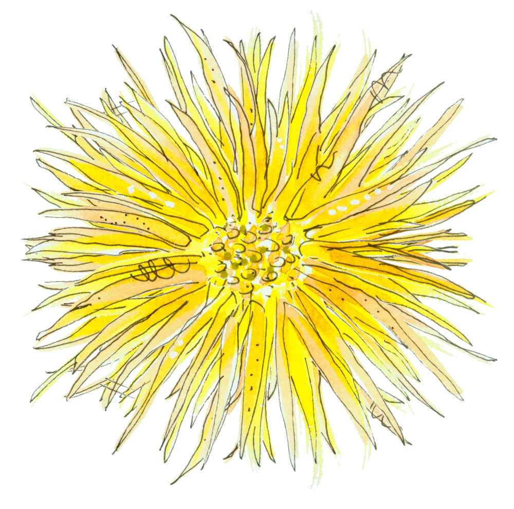
I made these simple flowers in all kinds of colors to add to text and create beautiful printable digital art.
If you create several flowers like this from a few different perspectives, you can group them and add them to all kinds of things, like printable invitations, for example.
Here’s the same type of flower, but from the side.
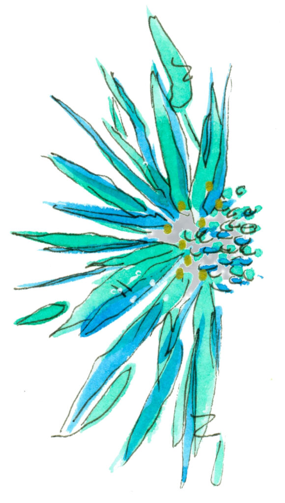
You can brighten anyone’s day with these easy watercolor painting techniques.
Paint on a card and give to that neighbor who’s having a difficult time.
Add to an encouraging note in your child’s lunchbox.
Scan the artwork and add to a printable grocery list to give away or enjoy for yourself.
So many possibilities and all can be done by old or young artists alike.
Watercolor painting is a wonderful way to boost your own mental health or those of others.
So let’s put it all together in this image.

Now you can actually see what I’m talking about.
Try to create enough imaginative flowers to create your own border or grouping.
This painting looks sweet on a bookmark.
A Whimsical Painting Style
The best thing about doing an exploration of watercolor painting ideas – easy or simple – is discovering that easy doesn’t mean ignoring watercolor painting skills that look hard.
Sometimes if a painter enjoys doing a whimsical style it can sound difficult. Like lots of tiny details or advanced watercolour painting techniques.
While this certainly can be the case, it doesn’t need to be.
Take this rainbow painting I’ve created.
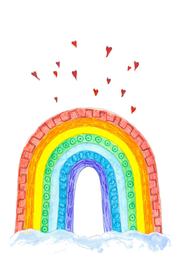
I literally free handed the rainbow arches (and you can just as easily trace them). I used watercolor pencils to fill in the spaces and then brushed carefully with water.
After letting it dry, I went back over the arches with watercolor pencil and did a bit of doodling patterns. I did not brush out the doodles with water. You could also make the doodles in waterproof pen.
Then I added random watercolor red hearts.
This next whimsical idea is just as simple, maybe more so.
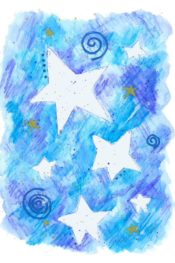
This night sky starts with protecting star shapes from the watercolor so they stay nice and white.
You can use rubber cement or masking fluid for this or simply draw in your star shapes and paint carefully around them – though it will be harder to keep the white areas totally white with the last method.
I used masking fluid with an old paint brush I have dedicated to that purpose.
After the fluid dried, I used a wet method and the simple steps of:
- creating a bluish wash technique for the background
- letting everything dry well, then using a mostly dry brush to scribble more blue paint in random places.
- I also scribbled using watercolor pencils
- and finishing up with a liner brush to create the blue spirals and
- a gold paint pen to add some opaque stars on top.
- When all is completely dry, rub off the masking fluid.
Trust me, once you try this you’ll find it’s not difficult. Very much another way to use a watercolor palette to make interesting textures.
An easy project using a simple design.
Continuing on with our list of easy watercolor ideas.
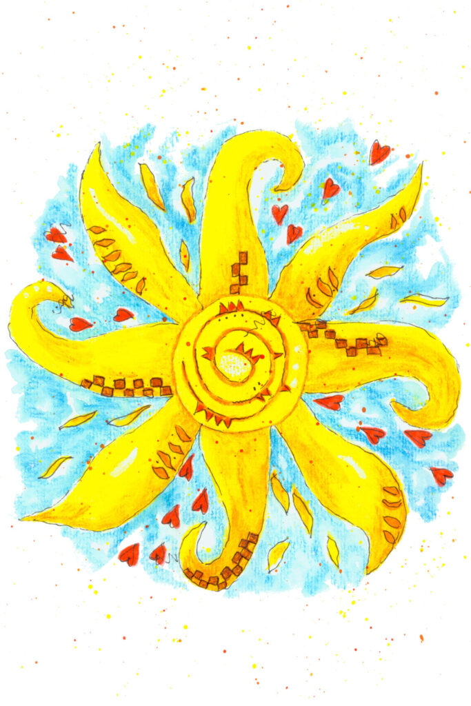
This bright and carefree sunshine can be traced or free handed. Then filled in with yellow paint. Add as much or as little detail to the sun’s rays as you like with additional layers of watercolor.
When dry, I used colored pencils to create the doodle patterns. Then I filled in with a bit of a wet brush on wet paper between the rays for that blue sky effect. This doesn’t take a lot of water, but again practice using a little bit of water and do one section at a time until you discover the amount of water that works best for you.
Remember, if you feel like you laid down too much water or paint in a section, using a paper towel is a great way to dab up the extra.
And also remember that watercolors go on the paper vibrant and tend to dry significantly lighter which is why adding layers works so well.
You’re ready for a challenge…

I saved what could be considered the most challenging whimsical watercolor painting for last in this section. A good quality design will allow you to break a painting down into its step instructions.
Draw or trace the moon and paint it yellow, remembering to leave a few white streaks to shine through. This really adds depth to your work.
Keep adding layers of yellow until you get the brightness you want. I also added a tiny bit of gray for shading. Then add a background wash. I used blues and grays swirling together.
This could be a great place to use a salt technique (sprinkling table salt on the wet watercolor makes for a beautiful effect and awesome texture), but I didn’t do this on my own painting.
Then paint in the background stars and you can see I added a watercolor red heart handing by a sweet striped string.
This string is not difficult to master! I suggest sketching it on a scratch piece of watercolor paper and using a liner brush to carefully fill in some stripes.
This kind of detail is fun and surprisingly easy but it adds a real pop to your work and when doing the whimsical style, you can add all kinds of little details and it looks right.
If this feels a bit much for you, remember you are choosing your own style and the best way to do that is to experiment.
Your own skill level is determined by the amount of experimenting and practice you do, so keep at it! You’ve got this! I know you do!
Even More Easy Watercolor Painting Ideas – Different Ways of Lettering
A different way of painting for a beginner watercolor artist is hand lettering.
You can get different results with just a few different techniques.

Create your own watercolor letters in just a few minutes. One of the best ways to do this is to start with an existing font. Print the letters out at the size you want them, and practice drawing around them adding peaks and swirls until you get the look you want.
This look is meant to be very organic which means no straight lines or perfection needed! Transfer your completed drawn letters to watercolor paper and paint as desired.
I used a wet on wet technique to get a beautiful blue-green marble effect, which is what we’ve already practiced in this post.
This lettering artwork is also hand drawn.
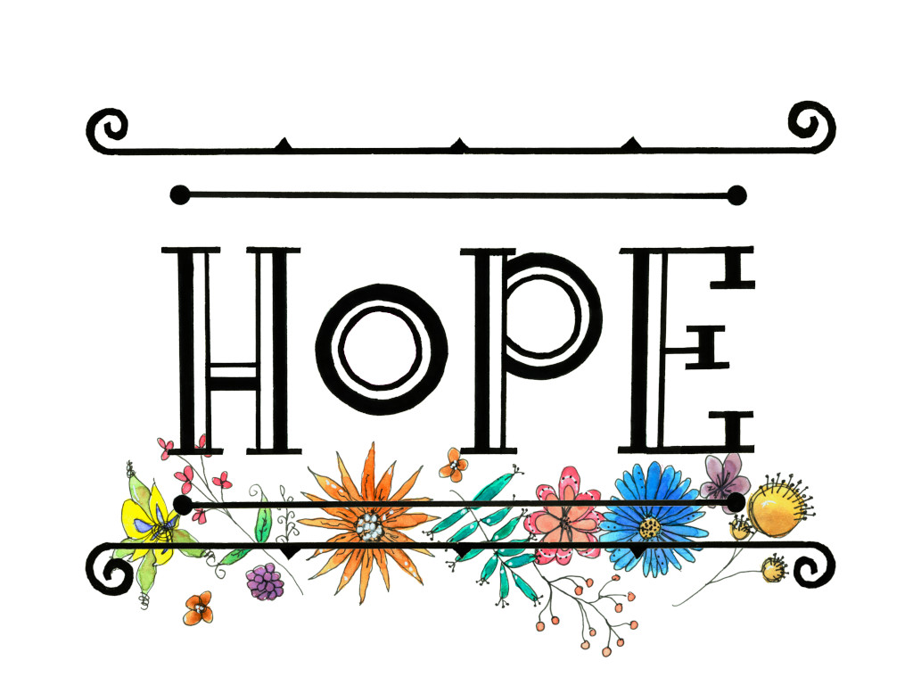
Use rulers to get your lines as straight as possible but understand when you paint or ink the letters by hand, you will lose the perfection of a computer font. And that’s just fine!
I inked the letters and scroll work, then added some of those fun watercolor flowers we practiced earlier in this post.
This is a similar idea but with its own flair.
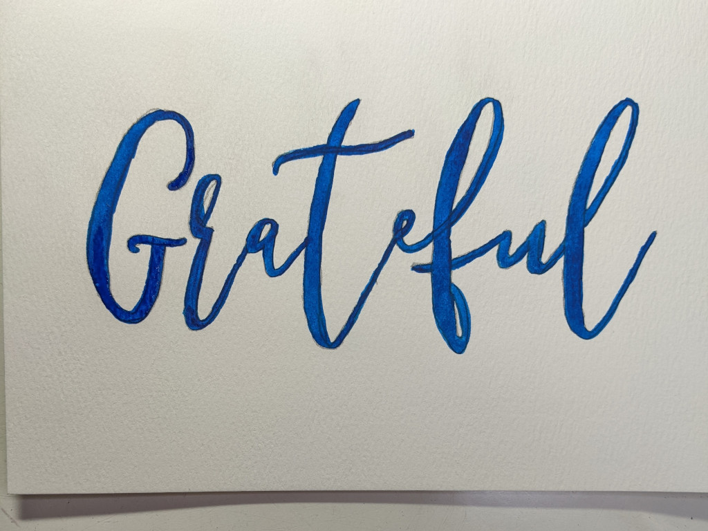
I chose a script font I liked, printed it out at the size I wanted, then outlined it onto watercolor paper.
Then I used a liner brush and a small round brush to fill it in with watercolor.
Again, the results are quite organic, which is what I wanted.
The key to doing this satisfactorily is choosing a font that will have spaces to fill in with paint. Only you can decide if you like to paint straight or curved edges, but I have found that the more a font is meant to look like handwriting the more the finished project is appealing to me.
You decide for your project and enjoy every second.
You’ll remember our wreath of leaves from earlier in this blog post.
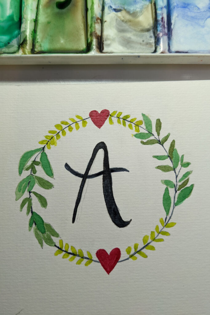
I told you we’d use it again and here we are.
This time instead of leaving it blank, I’ve filled it with a handpainted letter.
You can fill in a letter like this with ink or paint. I do both but this particular one is black watercolor and it took a few layers to get it as dark as I wanted.
Wet Paint With Fruits & Veggies
Fruits and veggies make wonderfully easy watercolor painting ideas.
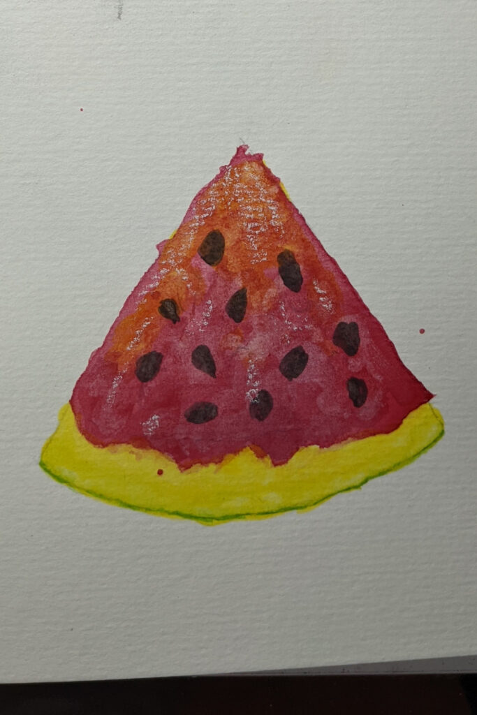
Starting with the beautiful, red, green and black, watermelon.
Trace or draw your watermelon slice. Lightly draw in your seeds. Since the seeds are black, you can either paint your background around them or just add the black seeds on top.
I laid down a layer of wet color which was pinkish yellow. Then as I added more layers of red; note how I left more of the lighter color showing through on the top where the light is reflecting.
And the deepest tones are at the bottom. Be sure and make the transition between red fruit and green rind a bit uneven and irregular (another good thing for a new watercolor artist).
Add the black seeds last with a small round brush. Take your time and practice shaping them carefully.
Round brush practice will pay off big dividends for you.
And last, but not least, I added some white highlights with a white chalk marker.
Lemons are always popular both as art and as a fruit.
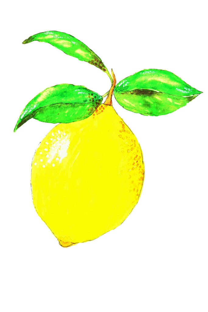
It’s easy to see that keeping your yellows light and bright are key here.
Use clean water and freshen it often to keep your colors bright.
Be sure and leave a light spot for your highest reflection point; that will make your painting pop.
Again, add as much or as little detail as you like. I aim to try something new or practice something deeper each time I paint. Really look at a reference photo or a real lemon. Study it a bit and your artwork will reflect what you’re learning.
Don’t just tackle the whole lemon but consider painting a slice.
Lemon and orange slices are just simply fun to paint so allow yourself to try painting one as a treat.
I drew mine out first and you can certainly trace a photo of one just as easily.
As you can see, I added my lemon watercolour to a printable with text added.
You can either do this digitally, using image editing software (I use Gimp), or you can paint your lemon and then hand draw the fonts you like around the lemon.
Easy peasy lemon squeezy.
A banana, honestly, is one of the easiest fruits to paint.
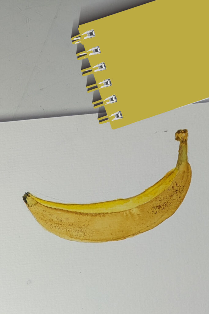
The first time I painted one I had to look twice because it looked so…real.
I had only been painting a short time and I was shocked. It seemed to flow out of my brush (& nothing had been doing that!).
There’s a definite line running along a banana. Paint the two sides of that line separately, with slightly different hues of yellow (you’ll notice that bananas have green and brown in them, too), add a touch of brown color at the stem and bottom end and you’ll have a watercolor banana you’ll be proud of.
The proverbial apple has been a staple in beginner artistry forever.
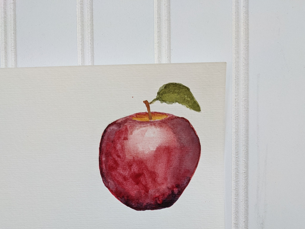
Doesn’t matter if you’re using watercolors, oils, acrylics, pencils, pastels, chalks; you name it, apples look good painted.
One reason apples are popular to paint is that they offer opportunities to practice several crucial painting skills.
- curves
- shading/highlights
- color gradation
- and there’s no need for perfection. Your apple can have all kinds of wobbles or misshapen sides (like mine!). Apples can be red, orange, green, brown, pink, yellow and purple.
I’ve painted apples with watercolors and watercolor pencils and also drawn them with regular colored pencils.
There are a ton of watercolor apple tutorial videos and classes, too. You can learn a lot by watching different styles and techniques and those classes will help you develop your own unique beautiful watercolor apple.
Since this is a blog post showing watercolor painting that is easy, I painted this apple as quick as I could. With as little shading as possible.
It took me about 10 minutes.
I only tell you that because the first time I painted one it took me a couple of hours. This apple could use several more advanced techniques. And yet, it still looks pretty good.
If you’ve been painting along with me throughout this post, I’m betting you already have practiced some techniques and can paint better than you thought you could.
Just keep going. And whenever you want a quick practice session that will tell you a lot about the current level of your skills, paint an apple.
I’ve got another, more detailed blog post on how to paint a watercolor apple so check that out.
Below is a technique study and I thought right here is a great place to insert it.
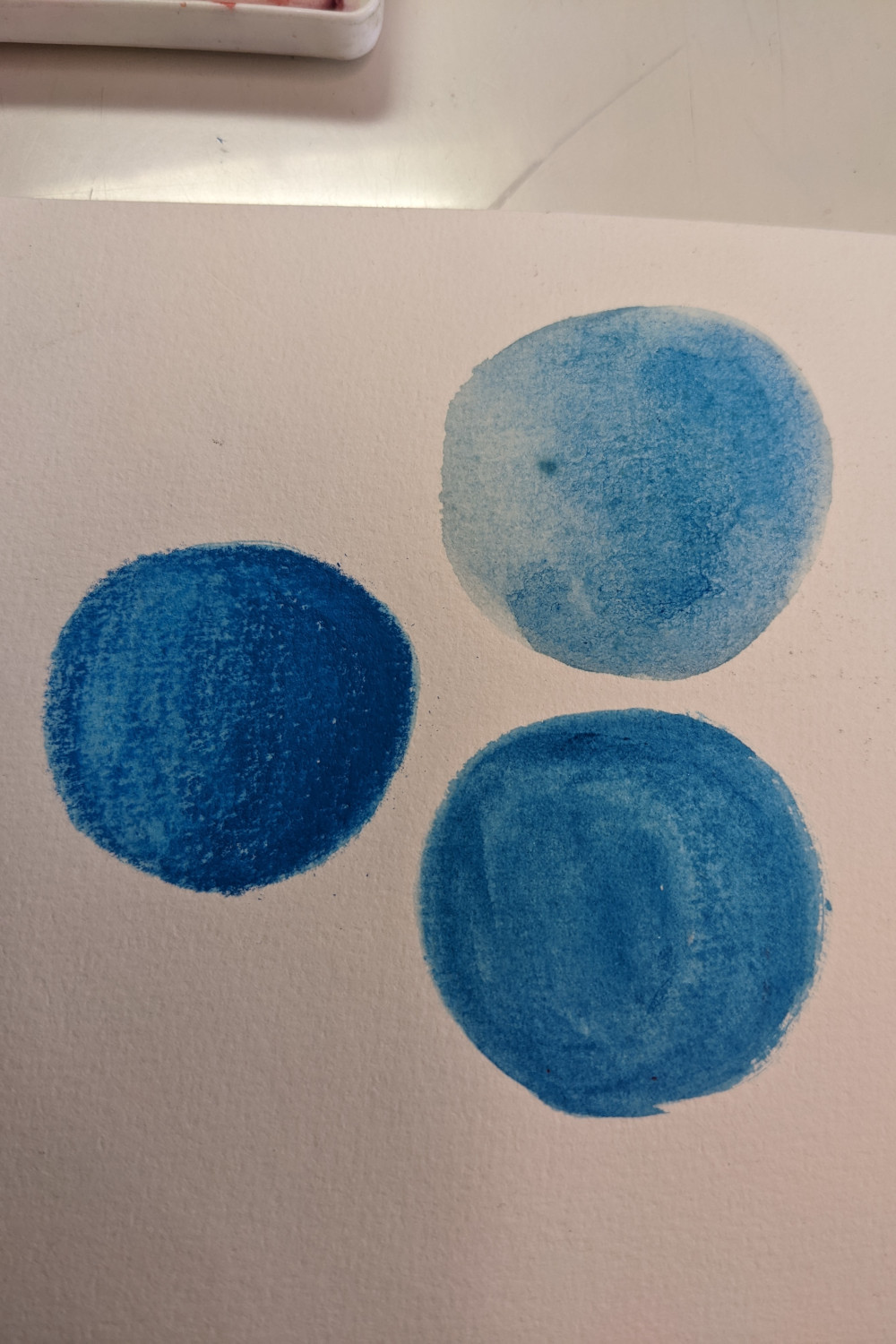
This beginner’s blog post is an overview and so there’s not a lot of detail here. (I will be linking back to this post from other posts where I go into more detail so keep checking back.)
But this is an easy tonal study that can help you see the difference in what your hand on a brush or pencil can do.
The upper right circle is a simple wash. I wet the paper and added color to one side of the wet circle and let it bleed.
Watercolor does this so beautifully.
The blue circle to the bottom right is done on dry paper with a slightly wet and color saturated round brush.
The color does not bleed using this technique and you can place the color exactly where you want it. However, because your watercolor paper is not wet the color will not float and it’s easy to be left with a hard edge somewhere you didn’t want one.
The blue circle on the left is done with watercolor pencils. I filled in the entire circle with the same amount of pressure, then went back over the shadowed side several times, laying down the amount of color exactly where I wanted the shadows.
Then I brushed out the circle with a wet brush, starting at the lightest side and moving to the darkest, washing out my brush as necessary to only drag paint where I want it.
A key to using watercolor pencils is to use them with the grain of whatever you’re drawing so when you add the water you still get the texture and direction of paint you want.
Practice! A teacher I had once really stressed the important of having enough in our art budget to be able to waste paper. She was so right! Thinking every piece of watercolor paper is absolutely precious means I tighten up and can’t make the mistakes or try the techniques necessary to learn.
Building on what we just learned…
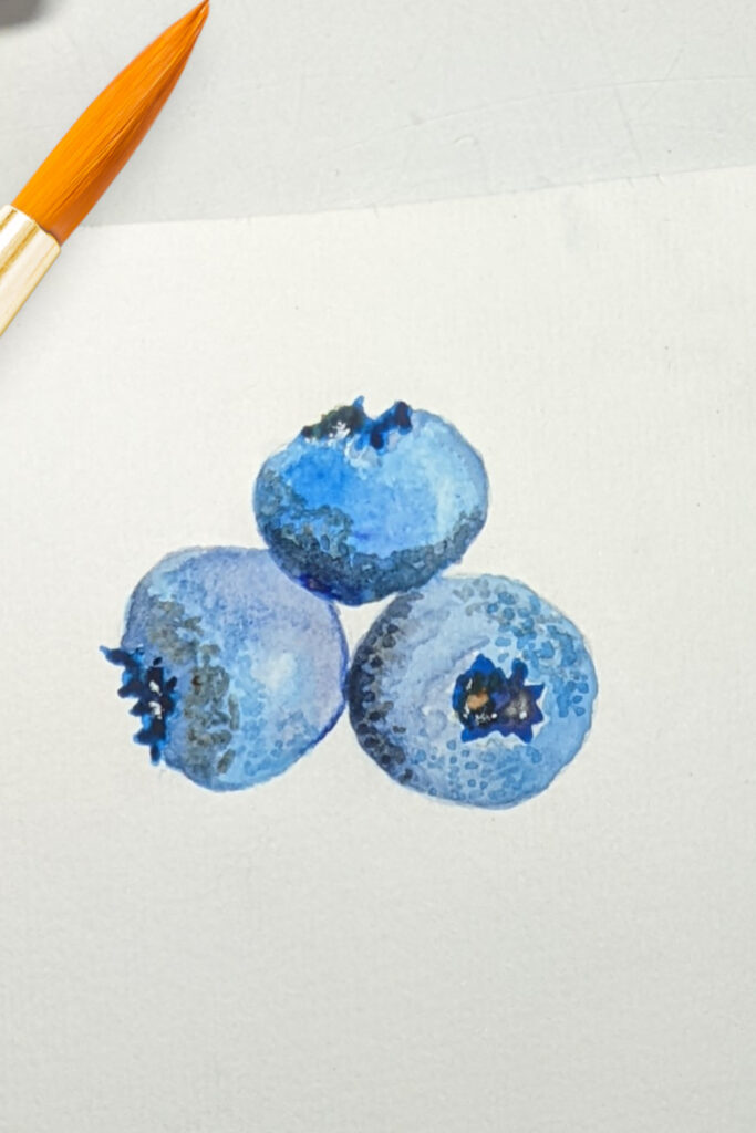
use those brush strokes to create these cute little blueberries.
Try to make each one a different tone. That simple step will help them stand out.
Keep in mind that while there are advanced watercolor techniques, many, many excellent techniques are not hard at all, just something you might not have tried before.
Keep painting!
A strawberry is another excellent fruit to practice in watercolor.
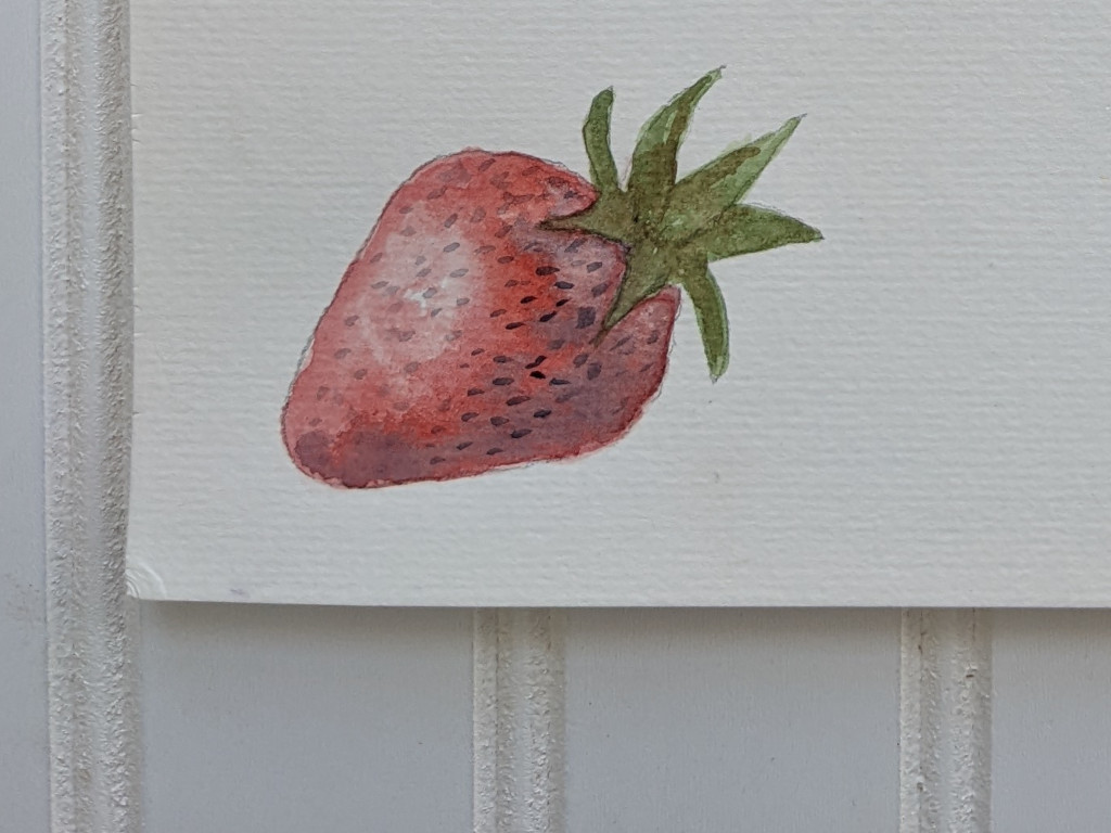
I’ll tell you upfront, it’s the shadows from the seeds that create a realistic strawberry. That’s the hard part. So for this strawberry I didn’t create any shadows except I made the seeds themselves a little darker in the shaded part of the berry and lighter in the part of the berry that’s reflecting the light.
When I needed to understand how to paint strawberries, I took a couple of quick classes and painted strawberries over and over for 2 days.
Yep, those berries got better fast! You can do that, too.
An avocado is pretty straightforward to paint.
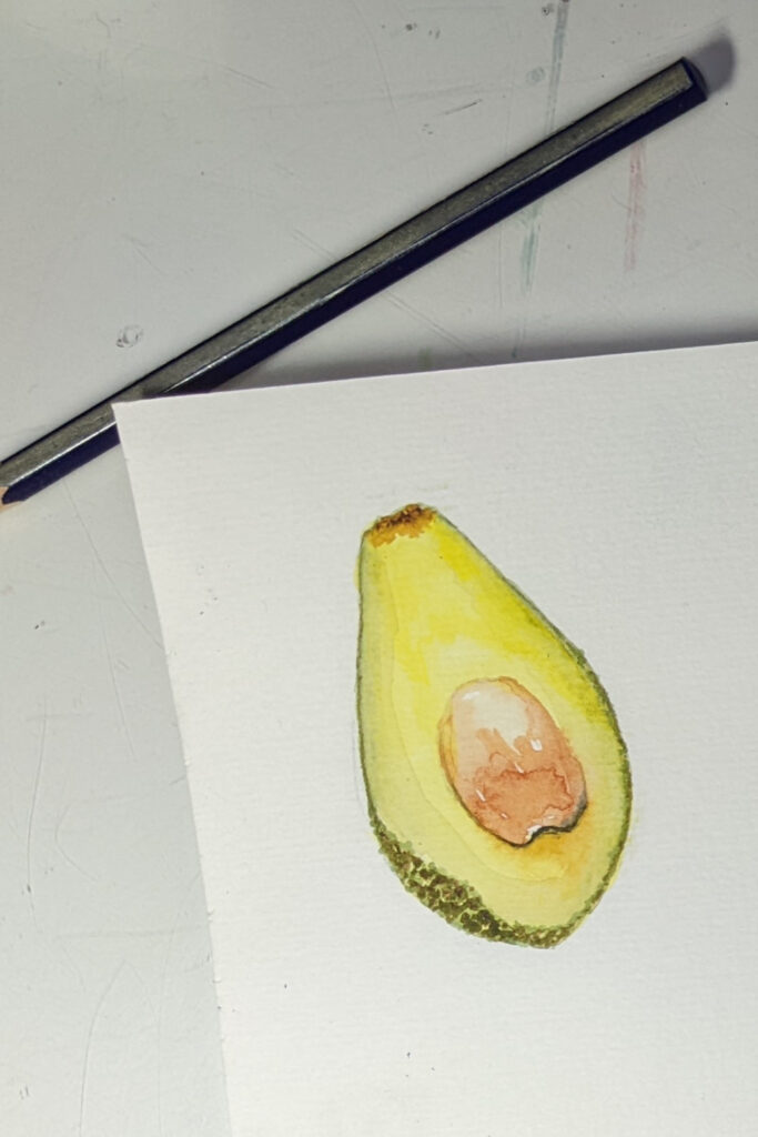
Note that to achieve the roundness of the pit, you’ll want a shiny top (so leave some white paper showing through for starters) and a very carefully drawn shadow around the bottom. Note how that shadow goes part way up the sides of the pit and even spills over gently onto the fruit at the bottom of the pit. You’ll probably want to use a tiny liner brush for this and a light hand.
And notice that fruit has speckles, spots, dents and the like. Adding a few of these tiny details carefully (don’t go overboard) is an easy way to get lifelikeness into your fruit.
Carrots!
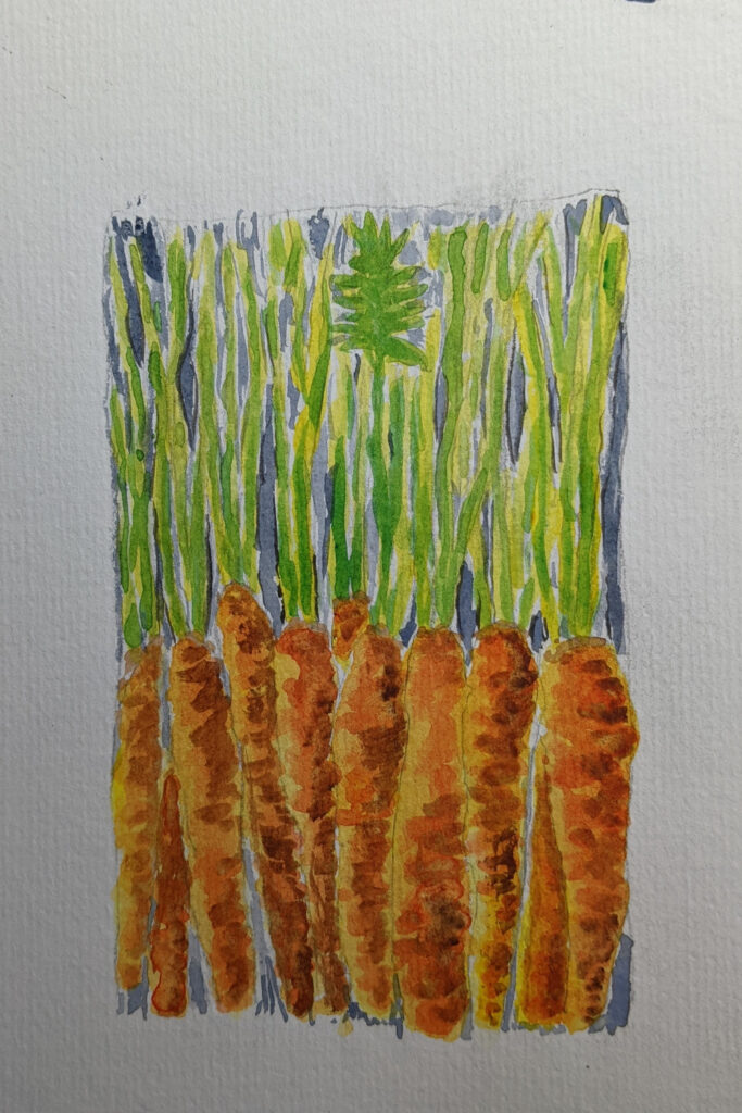
Carrots are a surprisingly easy subject matter to paint with watercolors.
Draw or trace, add the orange base and then a touch of soft brown for a shadow.
Drawing a bunch like this sometimes can fool the eye and you don’t need so many details, but painting a single carrot is definitely in the category of young artists or new artists.
And carrots are bright and cheery. Sort of a happy vegetable.
Bell peppers are a lot like apples…
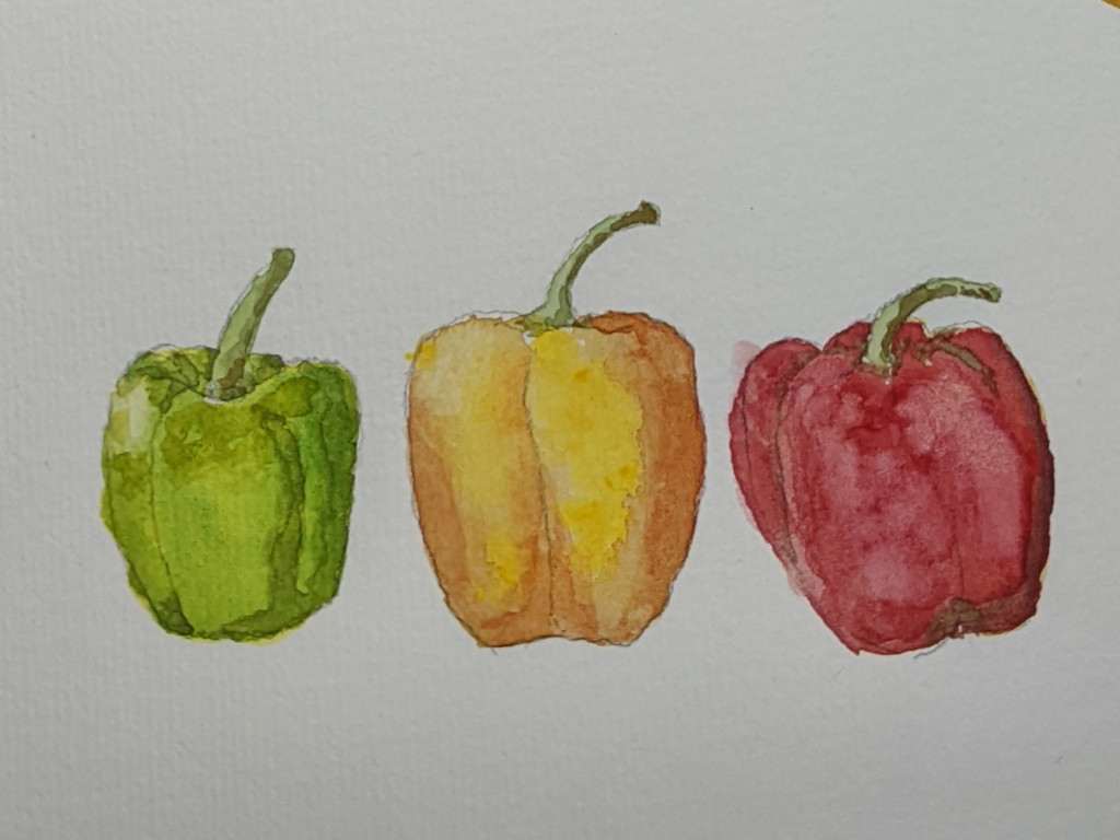
in that painting them can teach you quite a bit about contours and shading.
One thing you can do when you’re starting out painting, is practice shading in pencil before you paint.
Your hand is probably already used to using a pencil with precision and it can be easier to master a new skill using a familiar pencil before training your hand to do the same with a brush.
So pull out a sheet of drawing paper, trace or freehand your peppers, and then carefully decide where the shading is.
Some shading will be light, some will be dark.
Shade, erase, repeat.
Then tackle your watercolor bell peppers.
Watercolor Cherries are a popular idea to paint.
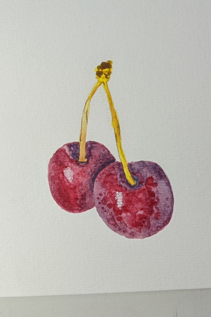
Why? Because painting their texture or shine can be tricky.
Don’t let that stop you, however.
These are a lot like the apples you’ve already done. It’s especially fun to paint two or more laying against each other because the contrast of visually showing one in front of the other is a fantastic skill to master.
Keep in mind that light against dark is what creates contrast. So if you have a shadow laying against something else that’s dark, you’ll need to add a light reflection to provide that contrast.
Take a few minutes to look – really look – at the items around you and you’ll see how this notion of contrast plays out in real life.
A very subtle shift from light to dark or dark to light tells your brain a lot. So when you paint things, you often only need a very subtle effect to get the job done.
A new design idea for you.
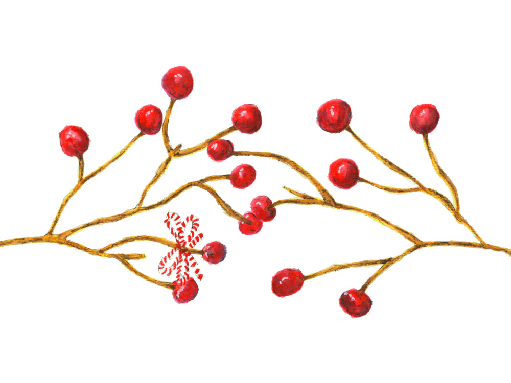
Now that you’ve done so many of these fruits and veggies, try a little project. Here are some simple red Christmas berries. I’ll tell you a secret. These were among the first berries I ever painted.
There’s not much to them but they do what they’re supposed to do; look pretty. I added some super simple twigs and a little red and white striped string bow to dress them up.
Trust me, you can do this too.
Wouldn’t this look cute on a Christmas card? Or combined with the text of JOY?
Use your imagination and see what ideas you come up with.
Pine Trees & Tree Blossoms
Trees are always popular to paint in watercolor.
We’ll cover three different types briefly.
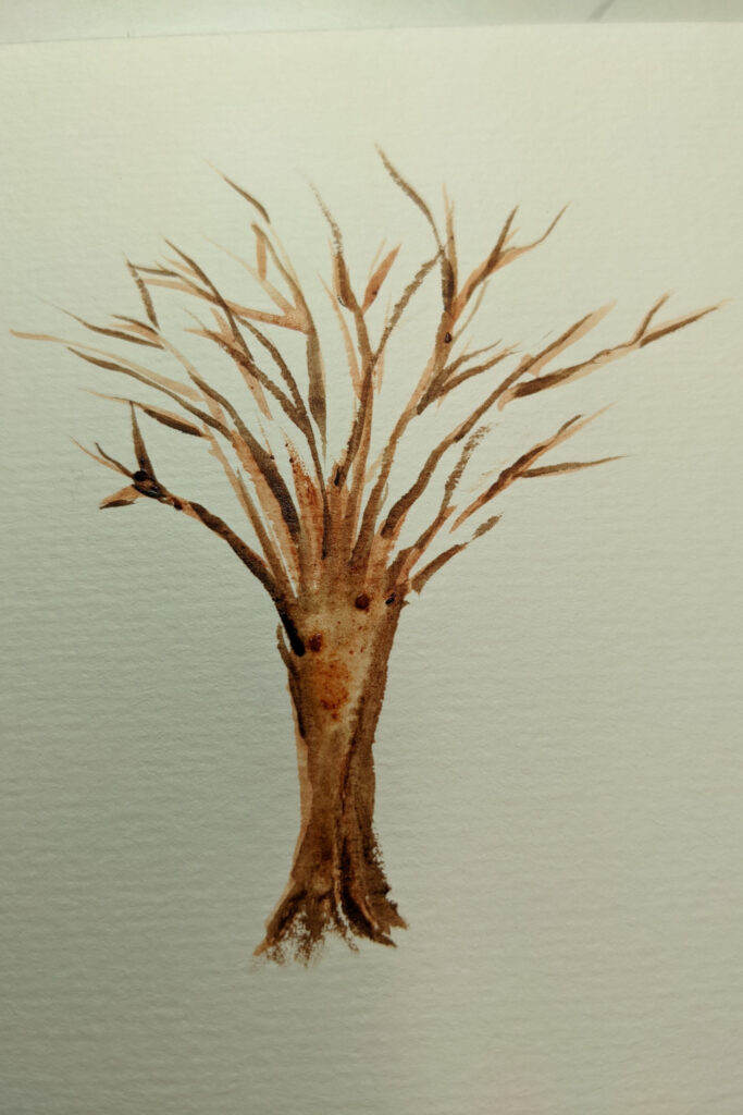
Start with a winter deciduous tree.
The branches are bare so there are no leaves to worry about painting.
Start by sketching (or tracing) the trunk and main branches.
Start the painting by using a mostly dry brush (to keep your edges neat) and a medium to light brown tone.
Go over the branches a couple of times, each time adding a darker brown to only one half and then to only the shadowed edge of the tree.
And don’t add the same shadowing to every branch. Mix it up which is what your eye sees when it looks at a real tree. A mix of light and dark and the suggestion of lines but nothing perfectly straight.
Random is good on a tree.
Take that same tree and complete the look.
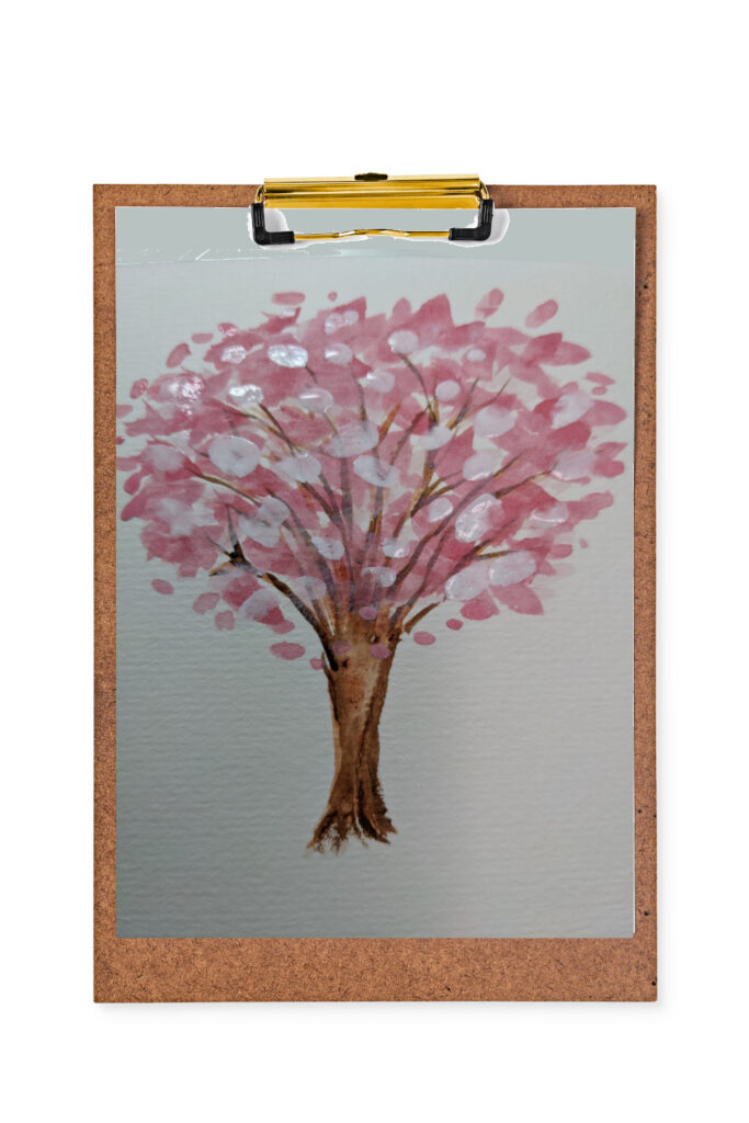
I’ve chosen a spring tree blossoming instead of green leaves. I’ve added pink abstract blossoms (so just dabbing the blossoms on; no painting of individual blossoms) in a couple of shades of pink and followed up (when dry) with a few dabs of white gouache.
White gouache is opaque so you can use it to add highlights over the top of darker watercolor. It’s a watercolor artist’s best friend.
Add a few pink blossoms randomly floating down off the tree for interest, if you like.
Watercolor pine trees will never go out of style.
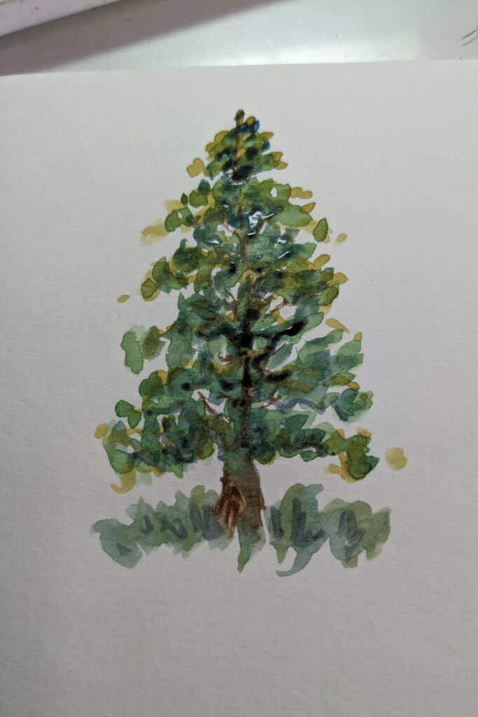
There are a lot of ways to paint pine trees using watercolor so this is only one method.
I’ve found it’s best to practice and gain confidence in several different methods of tree painting as this will make your work really shine when you start painting a lot of trees in one painting.
Start with painting a skinny trunk and the suggestion of several branches.
Then start dabbing green leaves on, creating the shape of the tree. You will layer different greens over each other, leaving white bits peaking through showing light.
It’s easy to overdo when painting leaves or needles. Sometimes it helps to paint a bit and step back for a look.
Learn when to stop!
Different Techniques – Ladybug, Fish, Owl, Butterfly
This is the category to include living critters. Painting animals or birds or insects or fish is very fun.
And it definitely can get challenging.
But it doesn’t need to start out that way.
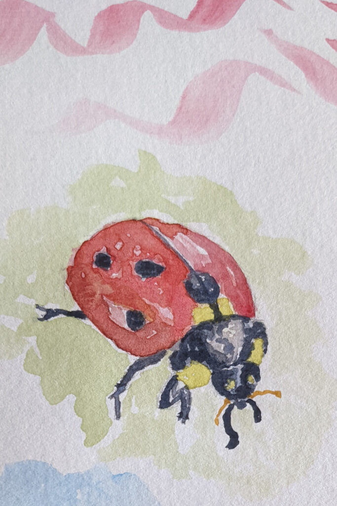
No two ladybug paintings will look alike.
That’s just fine. That’s the beauty of artistic style.
I suggest tracing a beautiful ladybug on clean watercolor paper and then laying down light washes of color, building up color slowly in different areas of the insect.
This will give the effect of dimension and depth.
As always, add the dark elements and details last.
Something helpful in this painting is adding a light wash around the ladybug to give contrast and make her stand out.
Choose a background wash color that is pleasing to the other paint colors you have chosen. And keep it light and subtle.
Use your watercolor paints to paint a fantastic tropical fish.
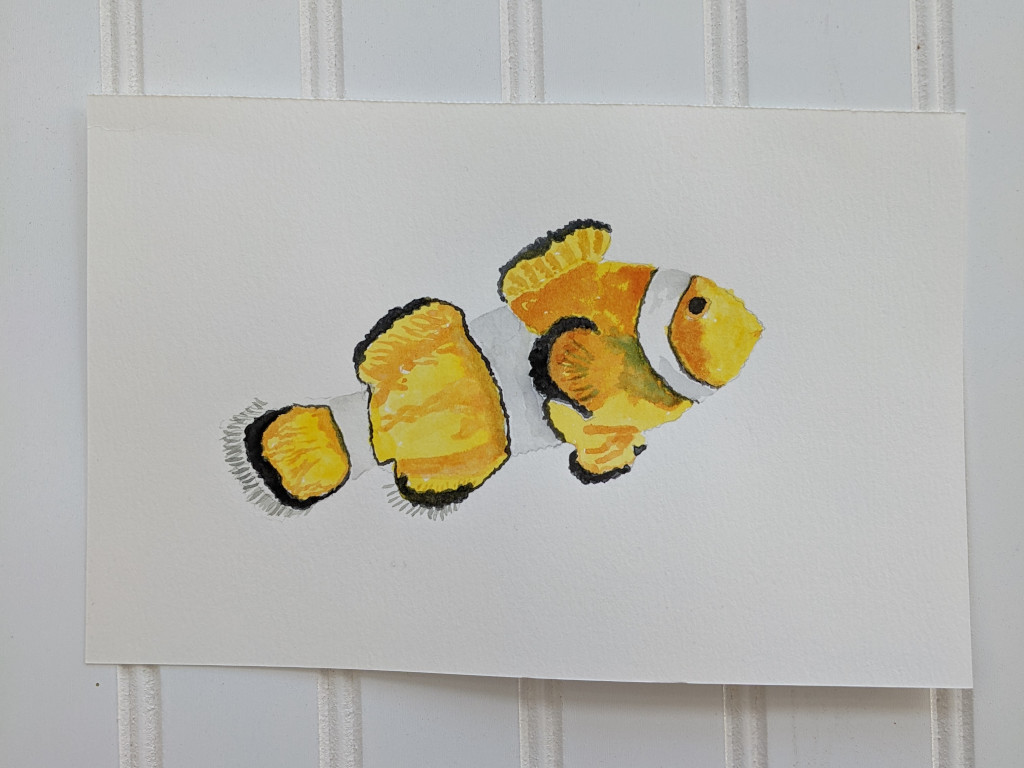
The vibrant colors are fun to work with. Remember to take your time and not rush.
Paint the fish in its actual natural colors or do something different and experiment with primary and secondary colors, learning a little about color theory as you practice your brush skills.
Use a color wheel to help you plan your painting.
I think you will enjoy painting butterflies in watercolor.
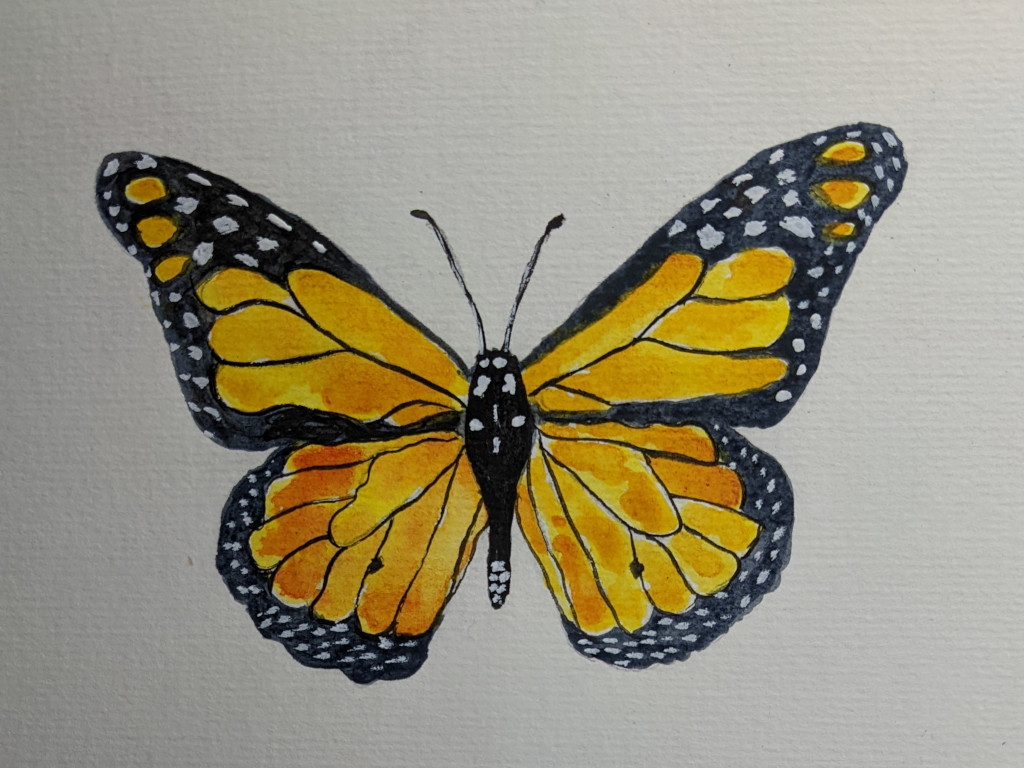
There are many ways to paint these delicate creatures, but the best way when you are just starting to paint is to follow the simple steps of:
- trace onto your paper
- carefully paint inside the lines
- when dry, add more layers of color being careful not to completely cover the layers of paint underneath.
- finish with a careful line brush filled with dark or black paint to outline the wing sections, the butterfly body and the antennae.
Very satisfying as a watercolor artist.
This is a printable watercolor and watercolor pencil owl I offer for sale on Etsy.
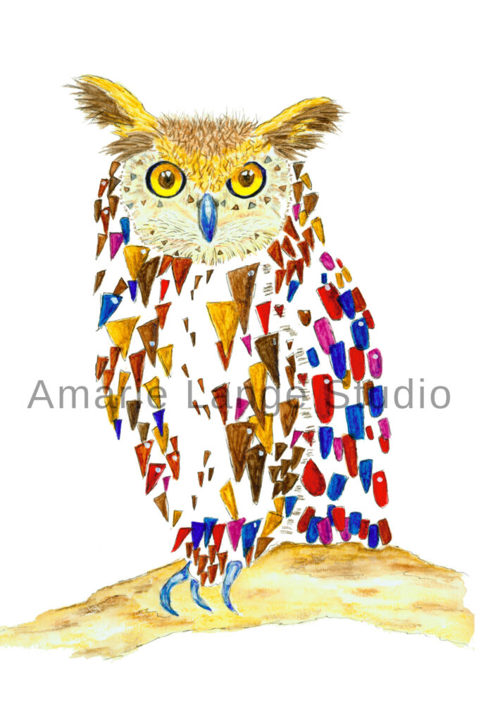
It is one of the first projects I ever painted.
{Want to draw it along with me? Come and learn how to draw an owl step by step. Free owl sketch to print out and help you.}
You might not want to copy it in detail, but I show it here because it fits into the category of easy watercolor ideas.
- Instead of painting every feather, I used the abstract idea of using geometry to show the owl feathers as colorful triangles.
- I left a lot of white showing through. This is not realism but closer to abstraction.
- I used bright colors not natural ones. This allowed me to control to mood of the painting. You can do the same with your animal painting.
- The hardest part of this painting is the eyes. Eyes are more challenging because the human eye is drawn to them, even in animals.
The sooner you tackle eyes in your paintings, the happier you’ll be. So take out that handy piece of scratch watercolor paper, watch a couple of watercolor classes on painting animal eyes, and paint eyes for a couple of hours.
They won’t be so intimidating anymore. Your confidence will soar!
Beginner Artists Life Painting – Objects From Life for Easy Watercolor Painting
Just looking around you will identify a wealth of objects that are ready for you to paint.
Here are some ideas that are easy to paint in watercolor, even if you’re just beginning.
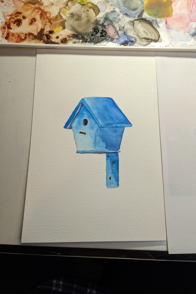
Birdhouses are quite fun to paint. I’ve painted actual birdhouses (painted the birdhouse itself) and I’ve painted images of birdhouses.
Both are fun.
The simplicity of painting a birdhouse in watercolor is that a birdhouse is an angular object.
Simply draw or trace one you like (and leave out any odd angles or details you don’t want to paint) and transfer to your watercolour paper.
The key to this painting exercise is to do it in sections. Do a wash on the roof, then a wash on one of the birdhouse sides. Let a section dry before painting an adjacent section so the paint does not bleed together.
For the easiest experience, paint your birdhouse in just one or two colors, as I did. I simply kept adding layers of paint in the areas that are shaded. The deepest shadows I used the deepest blue.
I added gray for the deepest shadow on the bird hole.
This is good practice for painting straight lines along the edge of each section.
Urban art: paint a simple city block of houses.
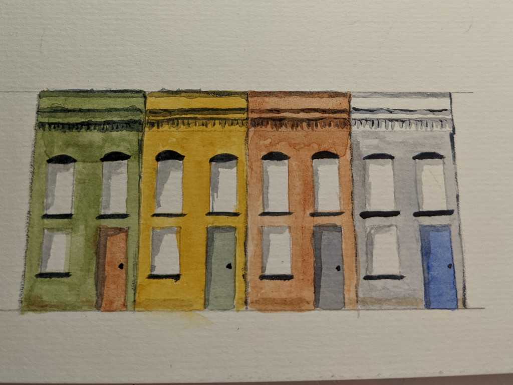
You can choose fun colors from your watercolor paints or stick with a brown color and gray. Decide on what architectural features to include and which ones you don’t want to paint.
I added a little subtle gray shadow on the inside of each window.
Try to add a little something extra to each thing you paint, too.
This little white church is a study in shadows.

With all of its roof lines, the shadows are happening everywhere.
And it’s white, so to separate it from the background it needs a lot of different grays.
Don’t shy off from a painting like this. It’s not as difficult as you might think.
It does require planning. You need to carefully plan the order and depth of your shadows so you don’t find yourself with a shadow on the wrong side of an eave or window.
But the church’s lines are simple and painting the red door makes it so inviting.
Find a good reference picture for a project like this and really study it before you even begin.
Take a few notes so you won’t forget what you’ve learned by studying the photo. Those will help so much when you start to paint.
Number out your steps until you’re comfortable with the process.
Doing a painting like this will help you see all of your painting with a more critical eye.
You can do this!
Painting bricks.
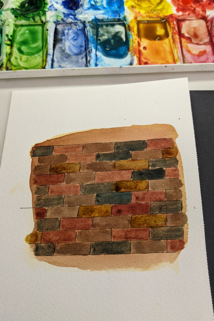
They can be gray. Red. With blueish hues. Certainly gray. Yellow. Even orange,
They can have dirt on them or be clean. Or have moss growing on them.
All of this gives you an advantage when painting bricks.
They are often a random jumble of colors so you don’t have to feel the need to “get it right,” whatever that may mean to you.
Paint a neutral light tan background for these particular bricks. Then add dark lines of some sort for grout. You can literally draw them on with a pen, as in this brick painting video (super helpful) or paint with a liner brush for excellent practice.
Then add your variegated bricks one by one. Pretty easy. As always, take your time.
These next three easy ideas are holiday paintings I did for a printable Christmas planner I sold on Etsy.
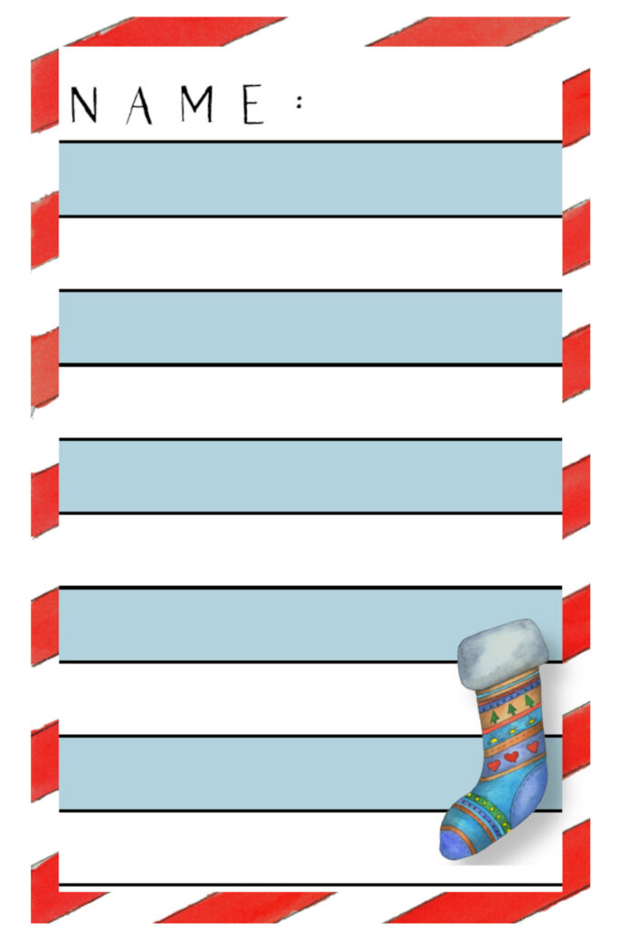
I wanted cute and happy so that’s how I painted these little gems.
I’m showing you the Scandinavian styled stocking placed on a colorful holiday wish list so you can see that whatever you paint, there’s a pleasant use for it, if you want it be productive.
That’s a big deal for me, personally. I want my artwork to be productive.
Just makes my day better using tools and resources that are covered in pleasing artwork.
How about you? Have you ever thought about all the everyday places that art could make your days better? Or someone you love?
A holiday mug dressed up with whipped cream and the word “Joy”.
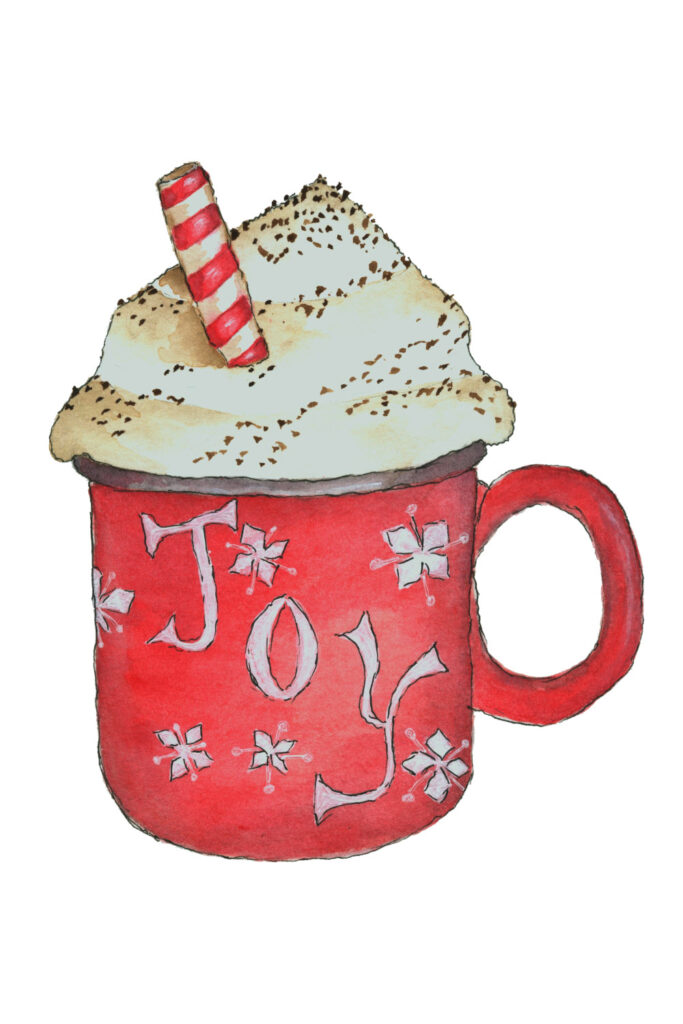
By now, you probably have a good idea how to paint this for yourself.
- Draw or trace your image.
- Draw any words or images (like the star doodles) on the cup before you start painting.
- Add as many washes of paint as you like, paying attention to the shaded areas and leaving any white areas…white!
- Note that on a round object like a mug, shading on both sides adds to the feeling of roundness.
- The whipped cream is created by using a very light wash of tan and building it up slightly where the shadows are. Don’t overdo!
- Add sprinkles with a liner brush and dark brown watercolor paint.
This snowman is one of my favorite characters.

Painting the snowman itself is like painting the whipped topping on the mug. Use very light washes of gray and stick to the outside edges of the snowman.
It’s adding the extras that makes this guy sparkle and it’s all beginner friendly.
I found pictures of scarves, hats and mittens I liked and changed the shapes, colors and patterns to make them my own.
I find studying doodling actually helps with this process.
Don’t forget the highlights on the eyes, even if it’s an imaginative person, like this snowman. The highlights truly give life to the painting.
Tea time!
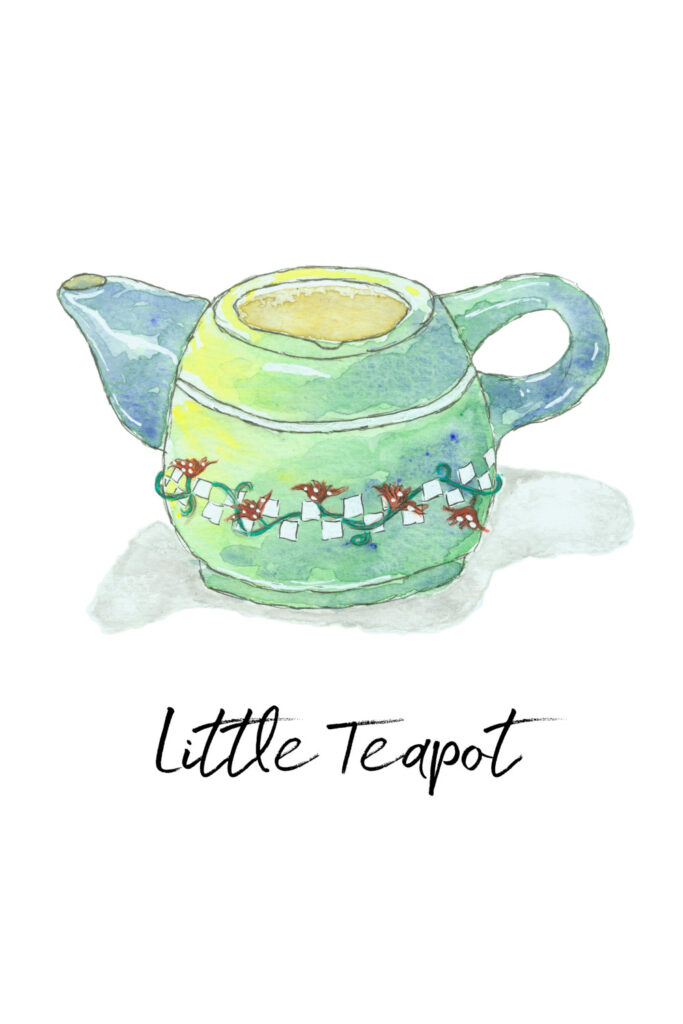
I took a teapot I own and used it for the shape; then painted it with the watercolors and whimsy I wanted.
You can certainly do the same.
This is also one of the first things I ever painted.
I took my time and that’s why I encourage you to do the same.
You’ll enjoy the process more and all the little details your brain is learning will have a chance to really soak in if you consistently practice.
I used this little gem on printable invites to a tea party I held for my grandkids.
Wouldn’t this look cute on a calendar someone kept in their kitchen? Sweet.
Basic Techniques – Starting Point For Nature
Let’s turn to easy painting ideas for watercolor in nature.
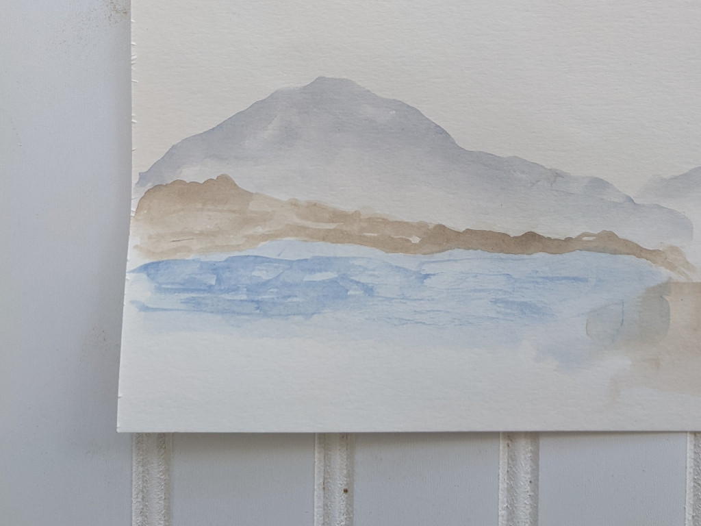
This is an abstract landscape painting. Everything is kept soft and subtle. I am hinting at the mountains in the distance, the foothills closer in, and the water in front.
No details. Just easy washes. And yes, feel free to draw or trace out a simple mountain outline to get yourself started.
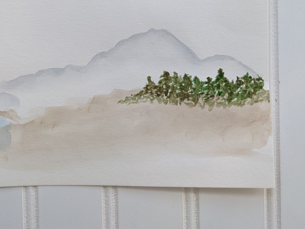
Similar to the last artwork, however the above mountain landscape abstract painting has no water but a treed area instead.
Again, keep the trees subtle with no details. Note how the trees fade away into the earth beneath them.
Sometimes the challenge with this type of wet technique is to keep everything at a distance, with only the different colors revealing what is in the background or foreground.
In other words, as an artist, I must know when to stop. I have found there is always more I think I need to do with a painting. But many times, it’s good to be finished and let the painting speak to me for a few days.
If there’s something about it I don’t like, I’ll take note of that for the next life painting.
Discovering the right way to finish is a good thing!
Not all of your paintings will be abstracts, of course.
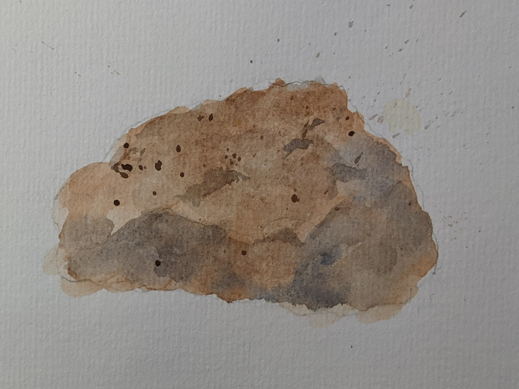
Painting a rock is an easy and important skill when doing landscape paintings.
Rocks come in all kinds of different colors, of course. This one I painted in browns, blues and grays.
I started with a simple watercolor wash, and once that dried, added different tones where the crevices and shadows of the rock are.
Then I added dark splatters at the end to give texture to this granite boulder.
Spatters or splattering is using a small paint brush (or even an old toothbrush) to load with paint and flick across the surface of your painting.
Warning: protect the portions of your painting where you do not want paint spatters as you will have very little control where the splatters go.
But it’s a great technique and adds tremendous texture to a painting.
Shifting gears with this painting, I’m showing you a more whimsical approach.
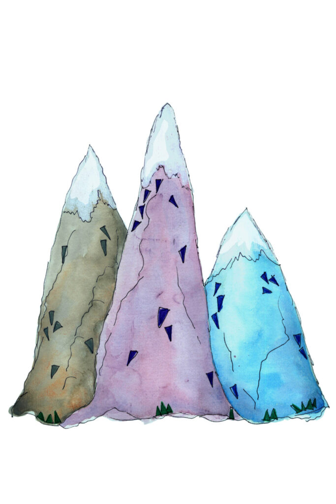
This easy watercolour mountain painting is one of my nursery printables available in my Etsy shop.
You’ll notice for interest, I again used triangles to show depth and texture over simple colorful washes.
These mountains are also subtly outlined with waterproof pen, helping them to stand out.
Fun and easy.
Watercolor fire can seem like a difficult challenge.
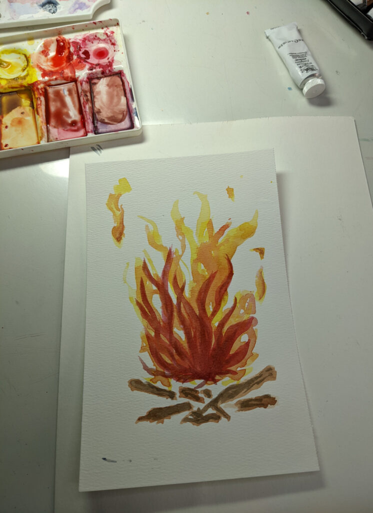
Fire’s movement can appear difficult to capture.
Again, planning is key with this type of painting. And while re-creating fire with watercolor can indeed get very advanced, it doesn’t have to be and this image is not difficult at all.
The best way to do this for the first time, in my opinion, is to print out a reference photo of a simple campfire.
Then trace over just the main flames. Keep it simple – intentionally.
Keep your watercolor palette simple, too. In order to make a fire look realistic in watercolor, you would need to do a lot of different hues in very subtle ways.
This takes time and a lot of focus. Patience is key.
But we’re not aiming for realism. Not yet anyway. So once you have your simple campfire traced, transfer it to your watercolor paper.
Start with painting bright yellow for lots of flames. Some of these will get painted over, but make sure you leave some of them shining brightly through the rest of your painting.
After the first layer dries, go in again with some orange watercolor. The redder orange. Then a bit redder. You decide how many layers of color you want to add, just remember to not overdo it.
Add some small bright yellow and orange flames floating away from your fire as sparks.
And anchor your campfire with a base of some sort, such as brown logs underneath.
And there you have it. A watercolor fire.
I have left some of the trickier subjects to paint until the very end of this blog post.
Why?
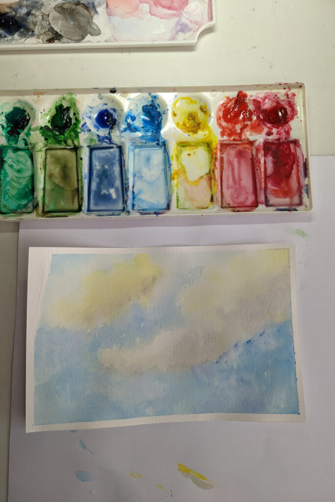
Because I wanted you to know that you can paint them. Even if you’re a beginner. If you’ve been following along with me, you are more than ready to paint fire, and now clouds.
{Get more info on how to paint clouds in watercolor.}
Here’s the easy thing to know about painting watercolor clouds: they can look anyway you want them to!
There’s a lot of variety in the sky and you get to decide what that will look like in your artwork.
Note the subtle colors in this clouds painting. Start by lightly sketching where you want the whitest of your clouds to be. That’s important because you don’t want to paint much, if anything, over those areas.
Stick with subtle pinks and yellows in the clouds themselves. Add soft blues around them. Add the tiniest amount of gray at the bottom of the clouds to add to their heaviness.
Clouds and skies require a light touch. You can always go back in and add a bit more color but if you get too much watercolor in those clouds…you now have a storm.
Which maybe is what you were aiming for all along!
Watercolor water.
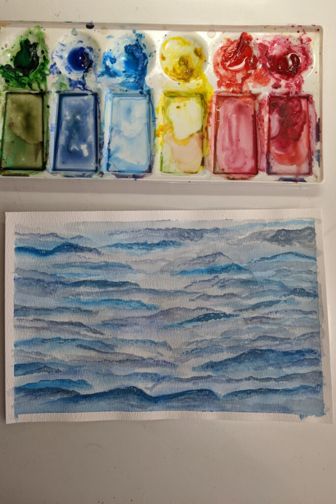
I’ll be honest with you; water can be a challenging thing to paint. Especially if you’re painting water with movement, such as waves in the ocean.
That being said, I was pleasantly surprised when I decided to take on learning how to paint water in watercolor.
I really studied some courses. Some classes I liked and learned a lot from and others were not so helpful.
I always asked myself what specifically I liked or didn’t like about a class because that helped me solidify what I was learning and recognize where my gaps were.
After a couple of days of practice, I was pleased with what my eye had learned – and my hand was still learning.
You can do this, too.
These types of watercolor tutorials are too complex for this type of blog post; so I’m going to share with you a water painting video that is very helpful.
I would suggest unpacking this video and practicing each part separately, just as we’ve talked about so much in this post.
Mastering each part of a wave or a section of water makes it easier to master the whole.
So…even creating watercolor water can be done by beginners, if you have the patience to practice and learn. In just a few tries, too.
I have more tips on how to paint water with watercolor on a different post, so check that out and see four different watercolor water ideas.
Well that’s it! We looked at over 75 easy watercolor painting ideas.
That was a lot but feel free to come back and practice as many easy watercolor painting ideas as you like, at your own pace.
I’m so excited for you! You’re learning so much and I’m sure you’ll be pleased with your hard work in a very short time.
So collect your watercolor supplies and keep practicing, keep investigating new techniques, keep encouraging yourself and the results will be pleasing for you, I’m sure.
Don’t forget to grab your watercolor practice checklist. It can help you stay the course and help you move forward in your watercolor adventure.
Time to go practice something new…